[1]:
import os,sys
%matplotlib inline
import matplotlib.pylab as plt
import pickle
import numpy as np
plt.rcParams['figure.dpi'] = 100
plt.rcParams['savefig.dpi']=300
# sys.path.append(os.path.expanduser("~/Projects/Github/PyComplexHeatmap"))
from PyComplexHeatmap import (
    ClusterMapPlotter,HeatmapAnnotation,anno_simple,anno_scatterplot,anno_lineplot,anno_barplot,
    anno_label,anno_boxplot,anno_img,use_pch_style,
)
use_pch_style() # or plt.style.use('default') to restore default style
# plt.rcParams
# import matplotlib; print(matplotlib.__version__)
[2]:
#set font to Arial using the following code
plt.rcParams['font.family']='sans serif'
plt.rcParams['font.sans-serif']='Arial'
# set pdf.fonttype to 42
plt.rcParams['pdf.fonttype']=42
Generate dataset
[3]:
#Generate example dataset (random)
df = pd.DataFrame(['GroupA'] * 5 + ['GroupB'] * 5, columns=['AB'])
df['CD'] = ['C'] * 3 + ['D'] * 3 + ['G'] * 4
df['EF'] = ['E'] * 6 + ['F'] * 2 + ['H'] * 2
df['F'] = np.random.normal(0, 1, 10)
df.index = ['sample' + str(i) for i in range(1, df.shape[0] + 1)]
df_box = pd.DataFrame(np.random.randn(10, 4), columns=['Gene' + str(i) for i in range(1, 5)])
df_box.index = ['sample' + str(i) for i in range(1, df_box.shape[0] + 1)]
df_bar = pd.DataFrame(np.random.uniform(0, 10, (10, 2)), columns=['TMB1', 'TMB2'])
df_bar.index = ['sample' + str(i) for i in range(1, df_box.shape[0] + 1)]
df_scatter = pd.DataFrame(np.random.uniform(0, 10, 10), columns=['Scatter'])
df_scatter.index = ['sample' + str(i) for i in range(1, df_box.shape[0] + 1)]
df_heatmap = pd.DataFrame(np.random.randn(30, 10), columns=['sample' + str(i) for i in range(1, 11)])
df_heatmap.index = ["Fea" + str(i) for i in range(1, df_heatmap.shape[0] + 1)]
df_heatmap.iloc[1, 2] = np.nan
[4]:
# add a missing value to sample4
df_heatmap.loc['Fea4','sample4']=np.nan
df_box.loc['sample4','Gene4']=np.nan
df_box
[4]:
| Gene1 | Gene2 | Gene3 | Gene4 | |
|---|---|---|---|---|
| sample1 | 3.372426 | 0.675964 | 0.686487 | -1.321620 |
| sample2 | 1.779563 | -0.189940 | -2.172234 | -0.401641 |
| sample3 | -1.036673 | 0.283042 | -0.834207 | -0.998767 |
| sample4 | -0.057797 | -0.989680 | 0.193180 | NaN |
| sample5 | -0.024317 | -1.431106 | -0.285825 | -0.196577 |
| sample6 | 0.473938 | -0.495792 | -0.400131 | -0.865397 |
| sample7 | 1.865600 | -0.803878 | 1.152069 | 1.207051 |
| sample8 | -0.085861 | 0.802672 | -1.461269 | -0.536236 |
| sample9 | -1.078730 | 0.882315 | 0.595347 | 1.072688 |
| sample10 | -0.148929 | 1.238203 | 0.746682 | 1.525596 |
Add selected rows labels
[5]:
#Annotate the rows with average > 0.3
df_rows = df_heatmap.apply(lambda x:x.name if x.sample4 > 0.5 else None,axis=1)
df_rows=df_rows.to_frame(name='Selected')
df_rows['XY']=df_rows.index.to_series().apply(lambda x:'A' if int(x.replace('Fea',''))>=15 else 'B')
row_ha = HeatmapAnnotation(
Scatter=anno_scatterplot(df_heatmap.sample4.apply(lambda x:round(x,2)),
height=12,cmap='jet',legend=False,grid=True,
legend_kws=dict(color='red')),
Line=anno_lineplot(df_heatmap.sample4.apply(lambda x:round(x,2)),
height=12,colors='red',linewidth=2,legend=False),
Bar=anno_barplot(df_heatmap.sample4.apply(lambda x:round(x,2)),
height=15,cmap='rainbow',legend=False,ylim=(-5,5)),
selected=anno_label(df_rows,colors='red',relpos=(-0.05,0.4)),
label_kws={'rotation':30,'horizontalalignment':'left','verticalalignment':'bottom'},
axis=0,verbose=0)
col_ha = HeatmapAnnotation(
label=anno_label(df.AB, merge=True,rotation=10,
arrowprops = dict(visible=False),
),
AB=anno_simple(df.AB,add_text=True),
axis=1,
CD=anno_simple(df.CD,add_text=True),
EF=anno_simple(df.EF,add_text=True,
legend_kws={'frameon':True}),
G=anno_boxplot(df_box, cmap='jet',legend=False,grid=True),
verbose=0)
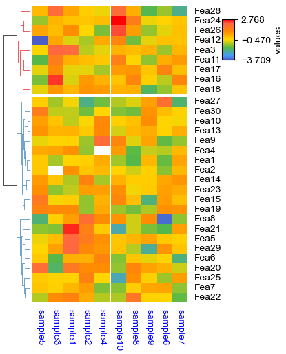
print(np.nanmin(df_heatmap),np.nanmax(df_heatmap))
plt.figure(figsize=(5.5, 6.5))
cm = ClusterMapPlotter(
data=df_heatmap, top_annotation=col_ha,right_annotation=row_ha,
col_cluster=True,row_cluster=True,
col_split=df.AB,row_split=2, z_score=0,vmin=-2.2,vmax=2.3,
col_split_gap=0.5,row_split_gap=0.8,
row_dendrogram=True,col_dendrogram=False,row_dendrogram_size=15,
show_rownames=False,show_colnames=True,
tree_kws={'row_cmap': 'Set1'},verbose=0,legend_vgap=5,
cmap='RdYlBu_r',bezier=True,dotsize=2,
legend_kws=dict(label='test'), #label='values',
xticklabels_kws=dict(labelrotation=90,labelcolor='blue',labelsize=14,grid_color='red',bottom=True))
# for ax in cm.top_annotation.axes[-1,:]:
# ax.cla()
plt.savefig("example0.pdf", bbox_inches='tight')
plt.show()
print(cm.kwargs['vmin'],cm.kwargs['vmax'],cm.legend_kws)
-3.0859623951909967 3.236613983779147
-2.2 2.3 {'label': 'test', 'vmin': -2.2, 'vmax': 2.3, 'center': None, 'extend': 'both', 'extendfrac': 0.15}
[6]:
cm.heatmap_axes
[6]:
array([[<Axes: >, <Axes: >],
       [<Axes: >, <Axes: >]], dtype=object)
Add annotations on the top of heatmap cells
[7]:
#Annotate the rows with average > 0.3
df_rows = df_heatmap.apply(lambda x:x.name if x.sample4 > 0.5 else None,axis=1)
df_rows=df_rows.to_frame(name='Selected')
df_rows['XY']=df_rows.index.to_series().apply(lambda x:'A' if int(x.replace('Fea',''))>=15 else 'B')

row_ha = HeatmapAnnotation(
            S4=anno_simple(df_heatmap.sample4.apply(lambda x:round(x,2) if not pd.isna(x) else ''),
                       add_text=True,height=10,legend=False,
                       text_kws={'rotation':0,'fontsize':10,'color':'blue'}),
            # Scatter=anno_scatterplot(df_heatmap.sample4.apply(lambda x:round(x,2)),
            #                  height=10),
            Test=anno_barplot(df_heatmap.sample4.apply(lambda x:round(x,2)),
                        height=18,cmap='rainbow',grid=True),
            selected=anno_label(df_rows,colors='red'),
            axis=0,verbose=0,#wgap=4,
            label_kws={'rotation':0,'horizontalalignment':'left',
                                        'verticalalignment':'bottom'})

col_ha = HeatmapAnnotation(
            label=anno_label(df.AB, merge=True,rotation=15),
            AB=anno_simple(df.AB,add_text=True),axis=1,
            CD=anno_simple(df.CD,add_text=True,text_kws=dict(bbox={'boxstyle':'Circle','edgecolor':'white','fill':False},fontsize=8),
                           height=4.5),
            EF=anno_simple(df.EF,add_text=True,
                            legend_kws={'frameon':False}),
            Exp=anno_boxplot(df_box, cmap='turbo',grid=True,
                             legend_kws=dict(cbar_height=30)),
            verbose=0,#hgap=2
            ) #verbose=0 will turn off the log.

print(df.head())
print(df_box.mean(axis=1))
print(df_heatmap.head())
plt.figure(figsize=(6, 8))
cm = ClusterMapPlotter(
            data=df_heatmap, top_annotation=col_ha,right_annotation=row_ha,
            col_split=df.AB,
            row_split=df_rows.XY,
            #col_split_gap=3.5,row_split_gap=2.5,
            col_cluster=True,row_cluster=True,
            label='values',row_dendrogram=False,
            show_rownames=True,show_colnames=True,
            verbose=0,legend_vgap=5,#legend_hpad=10,legend_vpad=5,
            legend_kws=dict(cbar_height=50),
            annot=False,fmt='.1g',linewidths=0.05,linecolor='gold',cmap='RdYlBu_r',
            xticklabels_kws={'labelrotation':-45,'labelcolor':'blue'},
            yticklabels_kws=dict(labelcolor='red'),#subplot_gap=8
)
#subplot_gap controls the gap between main heatmap and column or row annotations

plt.show()
print(cm.row_order)
print(cm.col_order)
             AB CD EF         F
sample1  GroupA  C  E -0.323408
sample2  GroupA  C  E  0.129683
sample3  GroupA  C  E -0.058445
sample4  GroupA  D  E -0.894142
sample5  GroupA  D  E -1.098099
sample1     0.853314
sample2    -0.246063
sample3    -0.646651
sample4    -0.284766
sample5    -0.484456
sample6    -0.321846
sample7     0.855211
sample8    -0.320173
sample9     0.367905
sample10    0.840388
dtype: float64
       sample1   sample2   sample3   sample4   sample5   sample6   sample7  \
Fea1  1.646839 -1.486046 -1.139292 -0.957969  1.384897  1.828904 -1.637039
Fea2 -1.383016  0.558109       NaN  0.998732  1.518328  1.002824  0.347313
Fea3 -1.129673 -0.300834 -0.520046 -0.505259  1.324026 -1.186532 -0.251901
Fea4  0.000484 -0.851028 -0.141047       NaN  0.326439 -0.894735  0.596000
Fea5  1.020989 -0.487709  0.276804 -1.330683 -0.028601  2.429588 -1.742817

       sample8   sample9  sample10
Fea1 -0.435036  0.429961  0.139677
Fea2  0.542437  0.131162  0.229218
Fea3  0.466405  0.305247 -0.490358
Fea4  1.095775 -0.626407 -0.743541
Fea5  0.883313 -0.041112 -0.544113
[['Fea11', 'Fea13', 'Fea9', 'Fea1', 'Fea5', 'Fea6', 'Fea7', 'Fea12', 'Fea8', 'Fea10', 'Fea14', 'Fea2', 'Fea3', 'Fea4'], ['Fea30', 'Fea20', 'Fea26', 'Fea17', 'Fea28', 'Fea15', 'Fea27', 'Fea29', 'Fea25', 'Fea18', 'Fea21', 'Fea16', 'Fea22', 'Fea24', 'Fea19', 'Fea23']]
[['sample5', 'sample1', 'sample3', 'sample2', 'sample4'], ['sample6', 'sample9', 'sample7', 'sample8', 'sample10']]
Only plot the annotations
[8]:
df = pd.DataFrame(['AAAA1'] * 5 + ['BBBBB2'] * 5, columns=['AB'])
df['CD'] = ['C'] * 3 + ['D'] * 3 + ['G'] * 4
df['F'] = np.random.normal(0, 1, 10)
df.index = ['sample' + str(i) for i in range(1, df.shape[0] + 1)]
df_box = pd.DataFrame(np.random.randn(10, 4), columns=['Gene' + str(i) for i in range(1, 5)])
df_box.index = ['sample' + str(i) for i in range(1, df_box.shape[0] + 1)]
df_bar = pd.DataFrame(np.random.uniform(0, 10, (10, 2)), columns=['TMB1', 'TMB2'])
df_bar.index = ['sample' + str(i) for i in range(1, df_box.shape[0] + 1)]
df_scatter = pd.DataFrame(np.random.uniform(0, 10, 10), columns=['Scatter'])
df_scatter.index = ['sample' + str(i) for i in range(1, df_box.shape[0] + 1)]
df_bar1 = pd.DataFrame(np.random.uniform(0, 10, (10, 2)), columns=['T1-A', 'T1-B'])
df_bar1.index = ['sample' + str(i) for i in range(1, df_box.shape[0] + 1)]
df_bar2 = pd.DataFrame(np.random.uniform(0, 10, (10, 2)), columns=['T2-A', 'T2-B'])
df_bar2.index = ['sample' + str(i) for i in range(1, df_box.shape[0] + 1)]
df_bar3 = pd.DataFrame(np.random.uniform(0, 10, (10, 2)), columns=['T3-A', 'T3-B'])
df_bar3.index = ['sample' + str(i) for i in range(1, df_box.shape[0] + 1)]
df_bar3.iloc[5,0]=np.nan
df_bar4 = pd.DataFrame(np.random.uniform(0, 10, (10, 1)), columns=['T4'])
df_bar4.index = ['sample' + str(i) for i in range(1, df_box.shape[0] + 1)]
df_bar4.iloc[7,0]=np.nan
print(df)
print(df_box.head())
print(df_scatter)
print(df_bar)
print(df_bar1)
print(df_bar2)
print(df_bar3)
print(df_bar4)
              AB CD         F
sample1    AAAA1  C  0.254305
sample2    AAAA1  C  0.310455
sample3    AAAA1  C  1.130318
sample4    AAAA1  D -1.072797
sample5    AAAA1  D -0.183928
sample6   BBBBB2  D -0.600199
sample7   BBBBB2  G -0.432629
sample8   BBBBB2  G  0.519978
sample9   BBBBB2  G -1.395984
sample10  BBBBB2  G -0.188171
            Gene1     Gene2     Gene3     Gene4
sample1 -0.636150  1.510495  0.684587 -0.276944
sample2  1.377482 -0.473817 -0.611217  0.549246
sample3  1.180300 -0.769914 -2.110681 -0.559654
sample4  0.809129  0.216816  0.297653  0.593800
sample5 -1.122830 -0.497229 -2.302483  1.153103
           Scatter
sample1   7.646102
sample2   4.805349
sample3   5.484791
sample4   0.358874
sample5   3.681125
sample6   2.484122
sample7   3.937073
sample8   9.460924
sample9   2.583757
sample10  8.622063
              TMB1      TMB2
sample1   5.695956  9.390414
sample2   2.443265  8.677675
sample3   0.330601  7.457853
sample4   6.484621  3.096932
sample5   1.541498  6.868015
sample6   4.446468  1.478602
sample7   6.655196  0.718169
sample8   3.928561  3.187372
sample9   2.918579  4.618439
sample10  8.841123  1.066763
              T1-A      T1-B
sample1   2.595999  6.966384
sample2   1.801357  2.016608
sample3   4.206355  4.876063
sample4   6.526524  1.587845
sample5   2.117259  6.797903
sample6   1.631543  5.038754
sample7   4.711377  9.152242
sample8   5.810381  9.771217
sample9   8.158108  7.624839
sample10  7.812774  7.755349
              T2-A      T2-B
sample1   7.520018  7.879519
sample2   5.152838  0.293367
sample3   3.230563  1.594893
sample4   6.299096  3.568840
sample5   6.544673  5.986220
sample6   1.121028  1.448027
sample7   0.726547  7.116671
sample8   7.648103  1.940870
sample9   6.826315  0.960380
sample10  3.686873  6.035101
              T3-A      T3-B
sample1   1.089464  6.505949
sample2   9.469335  0.196310
sample3   3.572588  3.100877
sample4   8.545448  7.255392
sample5   7.071401  0.055183
sample6        NaN  8.537407
sample7   7.707495  7.474489
sample8   1.739977  8.341830
sample9   6.951088  7.952240
sample10  1.848299  3.751172
                T4
sample1   6.500270
sample2   0.880184
sample3   4.775615
sample4   9.855571
sample5   8.719113
sample6   4.641860
sample7   2.084543
sample8        NaN
sample9   2.885198
sample10  8.780427
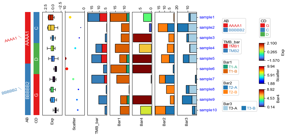
[9]:
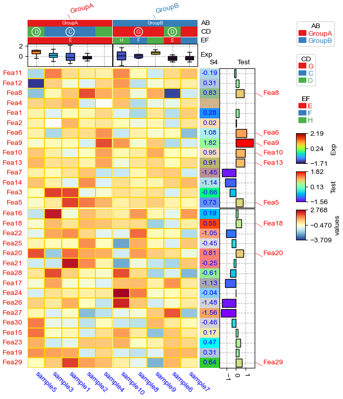
plt.figure(figsize=(4, 8))
col_ha = HeatmapAnnotation(
            label=anno_label(df.AB, merge=True,rotation=15),
            AB=anno_simple(df.AB,add_text=True), axis=1,
            CD=anno_simple(df.CD, add_text=True,text_kws={'color':'black'}),
            Exp=anno_boxplot(df_box, cmap='turbo',grid=True),
            Scatter=anno_scatterplot(df_scatter,legend=True,grid=True),
            Line=anno_lineplot(df_bar2,linewidth=4,colors={'T2-B':'orangered','T2-A':'yellowgreen'},
                              marker='D',legend=True),  #colors=['orangered','yellowgreen']
            TMB_bar=anno_barplot(df_bar,legend=True,cmap='Set1'),
            Bar1=anno_barplot(df_bar1,legend=True,colors=['red','black']), #colors can be str, list, tuple or dict
            Bar4=anno_barplot(df_bar4,legend=True,cmap='turbo'),
            Bar2=anno_barplot(df_bar2,legend=True,colors={'T2-B':'orangered','T2-A':'yellowgreen'}),
            Bar3=anno_barplot(df_bar3,legend=True,cmap='Paired'),
            plot=True,legend=True,legend_vgap=5,hgap=4,
            # legend_order=False,
            # legend_order=['AB','CD','Line','Bar1'],legend_width=20
)
col_ha.show_ticklabels(df.index.tolist(),fontdict={'color':'blue'},rotation=-30)
plt.show()
Plotting HeatmapAnnotations
Collecting annotation legends..
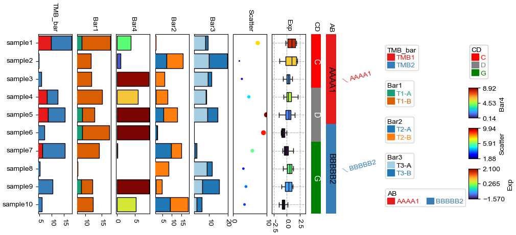
Change orentation to down and add extra space
[10]:
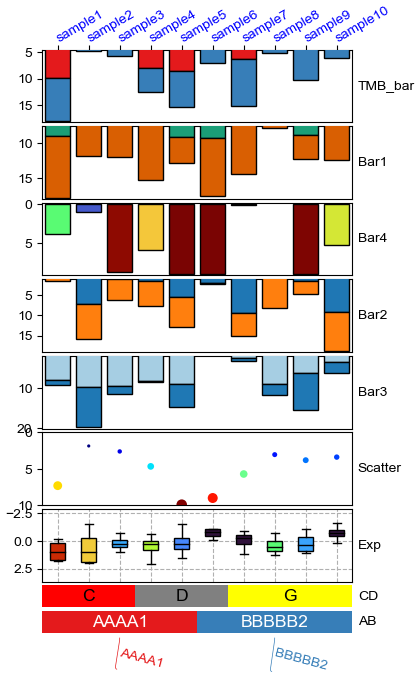
plt.figure(figsize=(4, 8))
row_ha = HeatmapAnnotation(
            TMB_bar=anno_barplot(df_bar,legend=True,cmap='Set1'),
            Bar1=anno_barplot(df_bar1,legend=True,cmap='Dark2'),
            Bar4=anno_barplot(df_bar4,legend=True,cmap='turbo'),
            Bar2=anno_barplot(df_bar2,legend=True,cmap='tab10'),
            Bar3=anno_barplot(df_bar3,legend=True,cmap='Paired'),
            Scatter=anno_scatterplot(df_scatter),
            Exp=anno_boxplot(df_box, cmap='turbo',legend=True,grid=True),
            CD=anno_simple(df.CD, colors={'C': 'red', 'D': 'gray', 'G': 'yellow'},
                           add_text=True,legend=True,text_kws={'color':'black'}),
            AB=anno_simple(df.AB,add_text=True,legend=True),
            label=anno_label(df.AB, merge=True,rotation=-15),
            plot=True,plot_legend=False,legend_hpad=13,axis=1,hgap=1
            )
row_ha.show_ticklabels(df.index.tolist(),fontdict={'color':'blue'},rotation=30)
plt.show()
# Here, we can use hgap (when axis=1) or wgap (when axis=0) to control the widh of height space between different annotations.
Plotting HeatmapAnnotations
Change orentation to the left
[11]:
plt.figure(figsize=(8, 4))
row_ha = HeatmapAnnotation(
            label=anno_label(df.AB, merge=True,rotation=15),
            AB=anno_simple(df.AB,add_text=True,legend=True,
                           #text_kws=dict(bbox={"pad":0},va='center',ha='center',rotation_mode='anchor')
                          ),
            CD=anno_simple(df.CD,add_text=True,legend=True),
            Exp=anno_boxplot(df_box, cmap='turbo',legend=True),
            Scatter=anno_scatterplot(df_scatter),
            TMB_bar=anno_barplot(df_bar,legend=True,cmap='Set1'),
            Bar1=anno_barplot(df_bar1,legend=True,cmap='Dark2'),
            Bar4=anno_barplot(df_bar4,legend=True,cmap='turbo'),
            Bar2=anno_barplot(df_bar2,legend=True,cmap='tab10'),
            Bar3=anno_barplot(df_bar3,legend=True,cmap='Paired'),
            plot=True,legend=True,legend_vgap=5,
            axis=0,legend_hpad=20,label_side='bottom',wgap=3,
            )
row_ha.show_ticklabels(df.index.tolist(),fontdict={'color':'blue'},rotation=0)
plt.show()
Plotting HeatmapAnnotations
Collecting annotation legends..
Incresing ncol
Incresing ncol
More than 3 cols is not supported
Legend too long, generating a new column..
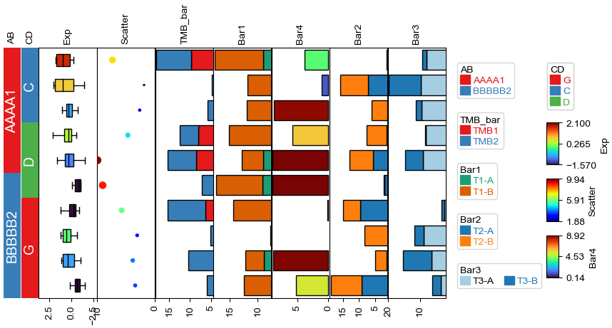
Change orentation to the right
[12]:
plt.figure(figsize=(8, 4))
row_ha = HeatmapAnnotation(
            TMB_bar=anno_barplot(df_bar,legend=True,cmap='Set1'),
            Bar1=anno_barplot(df_bar1,legend=True,cmap='Dark2'),
            Bar4=anno_barplot(df_bar4,legend=True,cmap='turbo'),
            Bar2=anno_barplot(df_bar2,legend=True,cmap='tab10'),
            Bar3=anno_barplot(df_bar3,legend=True,cmap='Paired'),
            Scatter=anno_scatterplot(df_scatter,grid=True),
            Exp=anno_boxplot(df_box, cmap='turbo',legend=True,grid=True),
            CD=anno_simple(df.CD, colors={'C': 'red', 'D': 'gray', 'G': 'green'},
                           add_text=True,legend=True,
                           text_kws={'rotation':-90}),
            AB=anno_simple(df.AB,add_text=True,legend=True,
                           text_kws={'rotation':-90,'color':'black'}),
            label=anno_label(df.AB, merge=True,rotation=15),
            plot=True,legend=True,legend_hpad=13,legend_vgap=5,axis=0,wgap=3,
            )
row_ha.show_ticklabels(df.index.tolist(),fontdict={'color':'black'},rotation=0)
plt.show()
Plotting HeatmapAnnotations
Collecting annotation legends..
Incresing ncol
Incresing ncol
More than 3 cols is not supported
Legend too long, generating a new column..
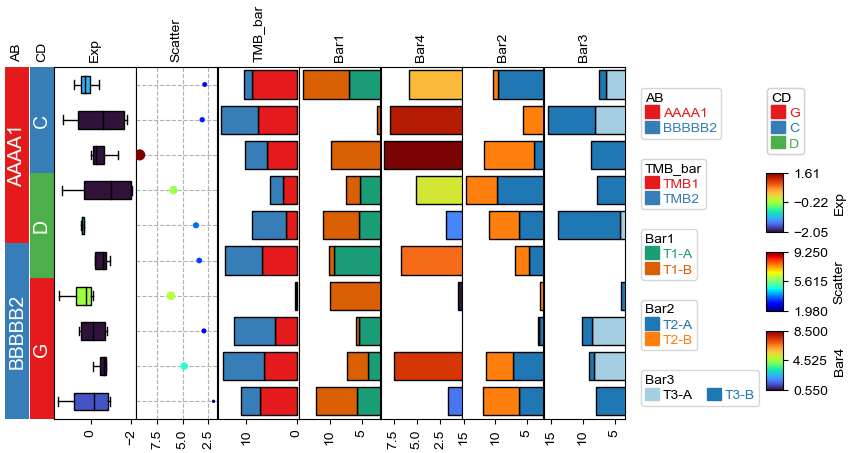
Changing orientation using parameter orientation
By Default, if there is no anno_label in the annotation, the oriention would be determined by parameter orientation.
[13]:
plt.figure(figsize=(8, 4))
col_ha = HeatmapAnnotation(
            AB=anno_simple(df.AB,add_text=True,legend=True),
            CD=anno_simple(df.CD,add_text=True,legend=True),
            Exp=anno_boxplot(df_box, cmap='turbo',legend=True),
            Scatter=anno_scatterplot(df_scatter,grid=True),
            TMB_bar=anno_barplot(df_bar,legend=True,cmap='Set1'),
            Bar1=anno_barplot(df_bar1,legend=True,cmap='Dark2'),
            Bar4=anno_barplot(df_bar4,legend=True,cmap='turbo'),
            Bar2=anno_barplot(df_bar2,legend=True,cmap='tab10'),
            Bar3=anno_barplot(df_bar3,legend=True,cmap='Paired'),
            plot=True,legend=True,axis=0,
            legend_vgap=5,orientation='left',
            )
plt.show()
Plotting HeatmapAnnotations
Collecting annotation legends..
Incresing ncol
Incresing ncol
More than 3 cols is not supported
Legend too long, generating a new column..

[14]:
plt.figure(figsize=(8, 4))
col_ha = HeatmapAnnotation(
            AB=anno_simple(df.AB,add_text=True,legend=True,
                          text_kws={'rotation':-90,'fontsize':14,'color':'black'}),
            CD=anno_simple(df.CD,add_text=True,legend=True,
                          text_kws={'rotation':-90,'fontsize':14,'color':'white'}),
            Exp=anno_boxplot(df_box, cmap='turbo',legend=True),
            Scatter=anno_scatterplot(df_scatter),
            TMB_bar=anno_barplot(df_bar,legend=True,cmap='Set1'),
            Bar1=anno_barplot(df_bar1,legend=True,cmap='Dark2'),
            Bar4=anno_barplot(df_bar4,legend=True,cmap='turbo'),
            Bar2=anno_barplot(df_bar2,legend=True,cmap='tab10'),
            Bar3=anno_barplot(df_bar3,legend=True,cmap='Paired'),
            plot=True,legend=True,axis=0,wgap=3,
            legend_vgap=5,orientation='right',
            )
plt.show()
Plotting HeatmapAnnotations
Collecting annotation legends..
Incresing ncol
Incresing ncol
More than 3 cols is not supported
Legend too long, generating a new column..
Add multiple heatmap annotations using for loop
Typically, we can create a heatmap annotatin using the following code:
col_ha = HeatmapAnnotation(
                        Group=anno_simple(df_cols.hypomethylated_samples,colors=sample_group_color_dict,legend=True),
                        CellType=anno_simple(df_cols.CellType,colors=ct_color_dict,legend=ct_legend),
                        M1=anno_simple(df_cols['M1'],cmap='jet',legend=lgd,vmax=1,vmin=0,legend_kws={'label':'M1'}),
                        verbose=0,label_side='right',label_kws={'horizontalalignment':'left'})
But what if we have many annotations, for example:
col_ha = HeatmapAnnotation(
                        Group=anno_simple(df_cols.hypomethylated_samples,colors=sample_group_color_dict,legend=True),
                        CellType=anno_simple(df_cols.CellType,colors=ct_color_dict,legend=ct_legend),
                        M1=anno_simple(df_cols['M1'],cmap='jet',legend=lgd,vmax=1,vmin=0,legend_kws={'label':'M1'}),
                        M2=anno_simple(df_cols['M2'],cmap='jet',legend=lgd,vmax=1,vmin=0,legend_kws={'label':'M2'}),
                        M3=anno_simple(df_cols['M3'],cmap='jet',legend=lgd,vmax=1,vmin=0,legend_kws={'label':'M3'}),
                        .....
                        verbose=0,label_side='right',label_kws={'horizontalalignment':'left'})
In this case, we can create an dict including the name and annotation as keys and values:
col_ha_dict={
                'Group':anno_simple(df_cols.hypomethylated_samples,colors=sample_group_color_dict,legend=True),
                'CellType':anno_simple(df_cols.CellType,colors=ct_color_dict,legend=ct_legend)
                }


for col in sample_cols:
    col_ha_dict[col]=anno_simple(df_cols[col],cmap='jet',legend=lgd,vmax=1,vmin=0,legend_kws={'label':col})

col_ha = HeatmapAnnotation(**col_ha_dict,
                           verbose=0,label_side='right',label_kws={'horizontalalignment':'left'})
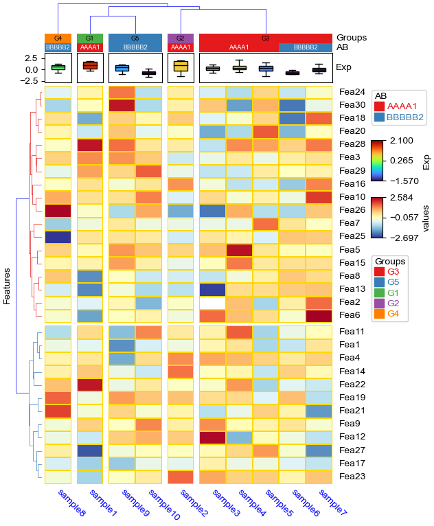
Cluster between groups and cluster within groups
Similar to cluster_between_groups and cluster_within_groups in R (https://jokergoo.github.io/2021/03/05/cluster-groups-in-complexheatmap/)
clsuter within groups: col_split=*, col_cluster=True
[15]:
df['Groups']=['G1']+['G2']+['G3']*5+['G4']+['G5']*2
col_ha = HeatmapAnnotation(
            Groups=anno_simple(df.Groups,add_text=True,text_kws={'color':'black'}),
            AB=anno_simple(df.AB,add_text=True),axis=1,
            Exp=anno_boxplot(df_box, cmap='turbo'),
            verbose=0) #verbose=0 will turn off the log.


plt.figure(figsize=(6, 8))
cm = ClusterMapPlotter(
        data=df_heatmap, top_annotation=col_ha,
        col_split=df.Groups,col_split_gap=2,
        col_cluster=True,row_cluster=True,col_dendrogram=True,
        label='values',show_rownames=True,show_colnames=True,
        tree_kws={'col_cmap': 'Set1'},verbose=0,legend_vgap=7,
        annot=True,fmt='.1g',linewidths=0.05,linecolor='gold',cmap='RdYlBu_r',
        xticklabels_kws={'labelrotation':-45,'labelcolor':'blue'},
        ylabel='Features',
        legend_order=['AB','Groups','Exp','values'] #change legend order
)
plt.show()
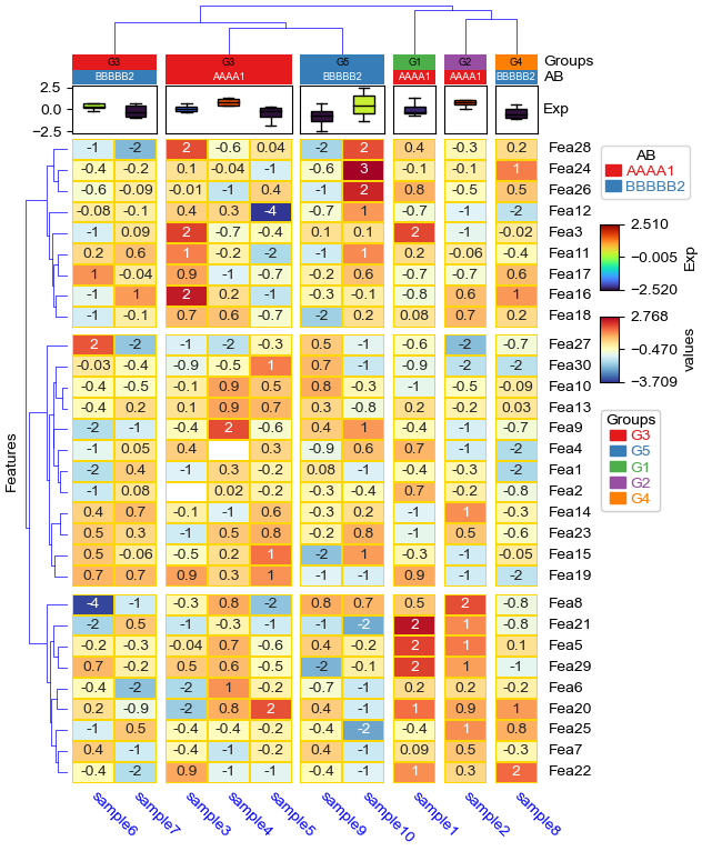
cluster_between_groups: col_split=*, col_split_order="cluster_between_groups",col_cluster=False
[16]:
plt.figure(figsize=(8, 10))
cm = ClusterMapPlotter(
        data=df_heatmap, top_annotation=col_ha,
        col_split=df.Groups, col_split_order="cluster_between_groups",
        col_split_gap=2,col_cluster=False,
        row_cluster=True,col_dendrogram=True,row_dendrogram_size=35,col_dendrogram_size=25,
        row_split=2,row_split_gap=1,row_dendrogram=True,
        label='values',show_rownames=True,show_colnames=True,bezier=True,dotsize=8,
        tree_kws={'colors':'blue','row_cmap':'Set1','col_cmap':'Paired'},
        verbose=0,legend_vgap=7,
        linewidths=0.05,linecolor='gold',cmap='RdYlBu_r',
        xticklabels_kws={'labelrotation':-45,'labelcolor':'blue'},
        ylabel='Features')
plt.show()
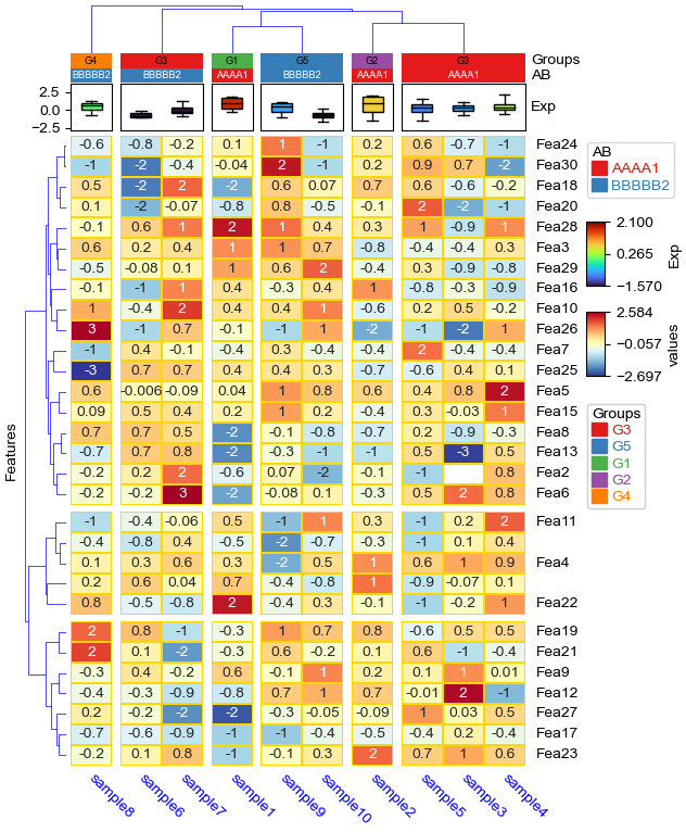
cluster_within_groups && cluster_between_groups: col_split=*, col_split_order="cluster_between_groups",col_cluster=True
[17]:
plt.figure(figsize=(6, 8))
cm = ClusterMapPlotter(
        data=df_heatmap, top_annotation=col_ha,
        col_split=df.loc[:,['AB','Groups']], col_split_order="cluster_between_groups",
        col_split_gap=2,col_cluster=True,row_split_gap=1.5,
        row_split=3,#row_split_order='cluster_between_groups',
        row_cluster=True,col_dendrogram=True,row_dendrogram=True,
        label='values',show_rownames=True,show_colnames=True,
        tree_kws={'colors':'blue'},verbose=0,legend_vgap=7,
        annot=True,fmt='.1g',linewidths=0.05,linecolor='gold',cmap='RdYlBu_r',
        xticklabels_kws={'labelrotation':-45,'labelcolor':'blue'},
        ylabel='Features')
plt.show()
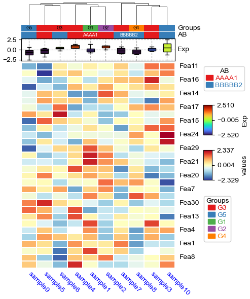
[18]:
# `label_kws` in `HeatmapAnnotation` control the heatmap annotaiton labels
col_ha = HeatmapAnnotation(
                Groups=anno_simple(df.Groups,add_text=True,text_kws={'color':'black'}),
                AB=anno_simple(df.AB,add_text=True),axis=1,
                Exp=anno_boxplot(df_box, cmap='turbo',grid=True),
                verbose=0,label_side='right'
)

# `xticklabels_kws` and `yticklabels_kws` control the ticklabels for the heatmap.
plt.figure(figsize=(6, 8))
cm = ClusterMapPlotter(data=df_heatmap, top_annotation=col_ha,
                       col_split=df.Groups,col_split_order=['G2','G1','G5','G4','G3'],
                       col_split_gap=4.5,col_cluster=True,
                       row_cluster=True,col_dendrogram=True,
                       label='values',show_rownames=True,show_colnames=True,
                       row_names_side='left',
                       tree_kws={'col_cmap':'Set1'},verbose=0,legend_vgap=7,
                       linewidths=0.05,linecolor='gold',cmap='RdYlBu_r',
                       xticklabels_kws=dict(labelrotation=-45,labelcolor='purple',labelsize=14),
                       #more parameters for [x/y]_ticklabels_kws, see: matplotlib.axes.Axes.tick_params or ?ax.tick_params
                       xlabel='Samples',ylabel="Features",
                       xlabel_kws=dict(color='white',fontsize=14),
                       ylabel_kws=dict(color='blue',fontsize=14,labelpad=45), #increace labelpad manually using labelpad (points)
                       xlabel_bbox_kws=dict(facecolor='black'),
                       ylabel_bbox_kws=dict(facecolor='chocolate',edgecolor='red'),
                      )
plt.savefig("test.pdf",bbox_inches='tight')
plt.show()
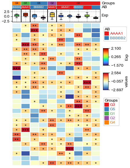
Custom annotation
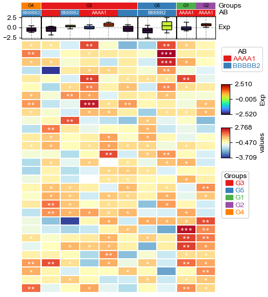
[19]:
annot=df_heatmap.applymap(lambda x:'∗∗∗' if x >= 2 else '∗∗' if x >=1 else '∗' if x >0 else '')
# To make asterisk located at center in vertical, use ∗ ASTERISK OPERATOR. instead of normal *; see: https://unicode-explorer.com/c/2217
plt.figure(figsize=(5, 6.5))
cm = ClusterMapPlotter(
        data=df_heatmap, top_annotation=col_ha,
        annot=annot,fmt=None,annot_kws={'color':'black','fontname':'Courier'},
        col_split=df.Groups, col_split_order="cluster_between_groups",
        col_cluster=True,row_cluster=True,
        label='values',
        tree_kws={'col_cmap': 'Set1'},verbose=0,legend_vgap=7,
        linewidths=0.05,linecolor='white',cmap='RdYlBu_r',
        xticklabels_kws={'labelrotation':-45,'labelcolor':'blue'})
plt.show()
Custom linkage
[20]:
import fastcluster
# custom column linkage
linkage = fastcluster.linkage(df_heatmap.T.apply(lambda x:x.fillna(x.median()),axis=1), method='average', metric='canberra')
print("df_heatmap shape:",df_heatmap.shape,"\nlinkage shape:",linkage.shape,"\n",linkage)

plt.figure(figsize=(4, 6))
cm = ClusterMapPlotter(
        data=df_heatmap, top_annotation=col_ha,z_score=0,
        col_cluster=True,row_cluster=True,show_rownames=True,show_colnames=True,
        label='values',col_dendrogram_kws=dict(linkage=linkage),col_dendrogram=True,
        tree_kws={'col_cmap': 'Set1'},verbose=0,legend_vgap=7,
        linewidths=0.01,linecolor='white',cmap='RdYlBu_r',
        xticklabels_kws={'labelrotation':-45,'labelcolor':'blue'})
plt.show()
df_heatmap shape: (30, 10)
linkage shape: (9, 4)
 [[ 0.          2.         17.35073065  2.        ]
 [ 5.          8.         17.43533202  2.        ]
 [ 4.         11.         19.52828344  3.        ]
 [ 7.          9.         19.59984958  2.        ]
 [ 3.         10.         20.10454901  3.        ]
 [ 1.          6.         20.31264009  2.        ]
 [13.         15.         20.90744671  4.        ]
 [14.         16.         21.77162909  7.        ]
 [12.         17.         23.1935837  10.        ]]
[21]:
df['Groups']=['G1']+['G2']+['G3']*5+['G4']+['G5']*2
plt.figure(figsize=(4, 6))
cm = ClusterMapPlotter(
        data=df_heatmap, top_annotation=col_ha,
        col_cluster=True,row_cluster=True,show_rownames=True,show_colnames=True,
        row_split=2,row_split_gap=3,row_dendrogram=True,
        label='values',col_dendrogram_kws=dict(linkage=linkage),col_dendrogram=True,
        tree_kws={'col_cmap': 'Set1','row_cmap':'Dark2'},verbose=0,legend_vgap=7,
        linewidths=0.01,linecolor='white',cmap='RdYlBu_r',
        xticklabels_kws={'labelrotation':-45,'labelcolor':'blue'})
plt.show()
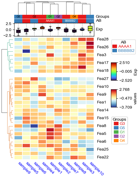
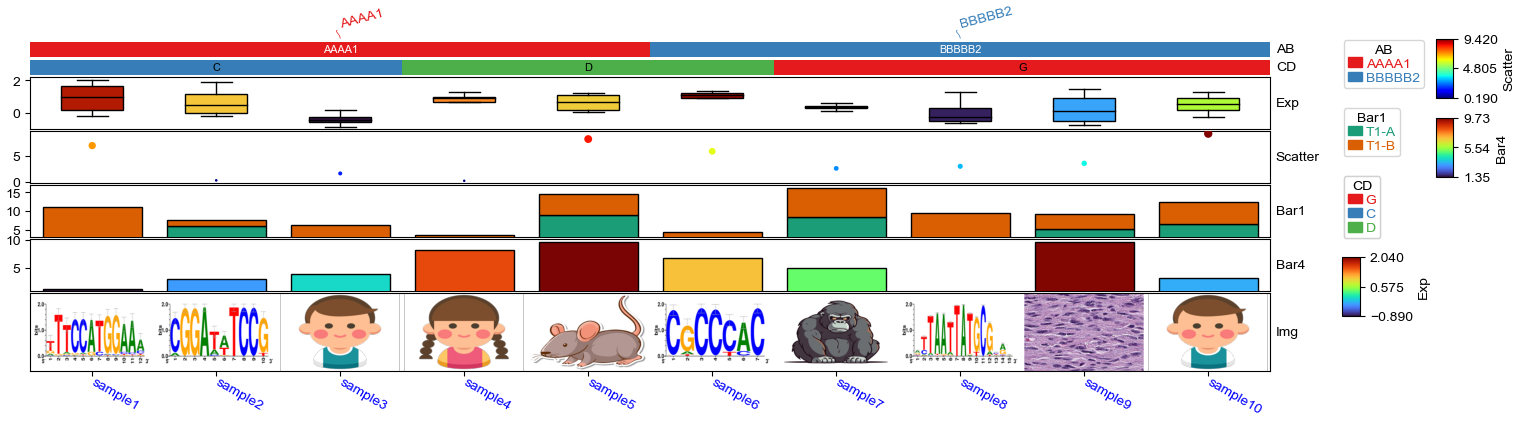
Image annotation
[22]:
df = pd.DataFrame(['AAAA1'] * 5 + ['BBBBB2'] * 5, columns=['AB'])
df['CD'] = ['C'] * 3 + ['D'] * 3 + ['G'] * 4
df['F'] = np.random.normal(0, 1, 10)
df.index = ['sample' + str(i) for i in range(1, df.shape[0] + 1)]
df_box = pd.DataFrame(np.random.randn(10, 4), columns=['Gene' + str(i) for i in range(1, 5)])
df_box.index = ['sample' + str(i) for i in range(1, df_box.shape[0] + 1)]
df_bar = pd.DataFrame(np.random.uniform(0, 10, (10, 2)), columns=['TMB1', 'TMB2'])
df_bar.index = ['sample' + str(i) for i in range(1, df_box.shape[0] + 1)]
df_scatter = pd.DataFrame(np.random.uniform(0, 10, 10), columns=['Scatter'])
df_scatter.index = ['sample' + str(i) for i in range(1, df_box.shape[0] + 1)]
df_bar1 = pd.DataFrame(np.random.uniform(0, 10, (10, 2)), columns=['T1-A', 'T1-B'])
df_bar1.index = ['sample' + str(i) for i in range(1, df_box.shape[0] + 1)]
df_bar2 = pd.DataFrame(np.random.uniform(0, 10, (10, 2)), columns=['T2-A', 'T2-B'])
df_bar2.index = ['sample' + str(i) for i in range(1, df_box.shape[0] + 1)]
df_bar3 = pd.DataFrame(np.random.uniform(0, 10, (10, 2)), columns=['T3-A', 'T3-B'])
df_bar3.index = ['sample' + str(i) for i in range(1, df_box.shape[0] + 1)]
df_bar3.iloc[5,0]=np.nan
df_bar4 = pd.DataFrame(np.random.uniform(0, 10, (10, 1)), columns=['T4'])
df_bar4.index = ['sample' + str(i) for i in range(1, df_box.shape[0] + 1)]
df_bar4.iloc[7,0]=np.nan
df_img = pd.DataFrame(['https://motifcollections.aertslab.org/v10nr_clust/logos/metacluster_136.1.png',
                       'https://motifcollections.aertslab.org/v10nr_clust/logos/metacluster_135.7.png',
                       'https://cdn3.iconfinder.com/data/icons/family-member-flat-happy-family-day/512/Brother-512.png',
                       'https://cdn3.iconfinder.com/data/icons/family-member-flat-happy-family-day/512/Sister-512.png',
                       'https://img.freepik.com/free-vector/sticker-design-with-cute-mouse-isolated_1308-59360.jpg',
                       'https://motifcollections.aertslab.org/v10nr_clust/logos/metacluster_131.8.png',
                       'https://img.freepik.com/premium-vector/vector-illustration-gorilla-isolated-white-background-cartoon-style_1151-66575.jpg',
                      "2.png",'1.jpeg',
                      'https://cdn3.iconfinder.com/data/icons/family-member-flat-happy-family-day/512/Brother-520.png'], columns=['path'])
df_img.index = ['sample' + str(i) for i in range(1, df_box.shape[0] + 1)]
[23]:
plt.figure(figsize=(16, 4))
col_ha = HeatmapAnnotation(
            label=anno_label(df.AB, merge=True,rotation=15),
            AB=anno_simple(df.AB,add_text=True,legend=True), axis=1,
            CD=anno_simple(df.CD, add_text=True,legend=True,text_kws={'color':'black'}),
            Exp=anno_boxplot(df_box, cmap='turbo',legend=True),
            Scatter=anno_scatterplot(df_scatter),
            Bar1=anno_barplot(df_bar1,legend=True,cmap='Dark2'),
            Bar4=anno_barplot(df_bar4,legend=True,cmap='turbo'),
            Img=anno_img(df_img.path,border_width=5,border_color=255,height=15),
            plot=True,legend=True,legend_vgap=5,hgap=0.5)
col_ha.show_ticklabels(df.index.tolist(),fontdict={'color':'blue'},rotation=-30)
plt.show()
Plotting HeatmapAnnotations
Collecting annotation legends..
How to force display all row/col ticklabels?
When the height or width is not big enough to display all xticklabels and yticklabels, some ticklabels will be hidden to avoid overlapping. For example:
[24]:
plt.figure(figsize=(3.5, 5))
cm = ClusterMapPlotter(
        data=df_heatmap,
        col_cluster=True,row_cluster=True,
        col_split=df.AB,row_split=2,
        col_split_gap=0.5,row_split_gap=0.8,
        label='values',row_dendrogram=True,
        show_rownames=True,show_colnames=True,row_names_side='right',
        tree_kws={'row_cmap': 'Set1'},verbose=0,legend_vgap=5,
        cmap='meth2',xticklabels_kws={'labelrotation':-90,'labelcolor':'blue'})
plt.show()
To force display all ticklabels no matter whether the height or width is big enough, set parameters xticklabels/yticklabels to True:
[25]:
plt.figure(figsize=(3.5, 5))
cm = ClusterMapPlotter(
        data=df_heatmap,
        col_cluster=True,row_cluster=True,
        col_split=df.AB,row_split=2,
        col_split_gap=0.5,row_split_gap=0.8,
        label='values',row_dendrogram=True,
        show_rownames=True,show_colnames=True,
        row_names_side='right',yticklabels=True,
        tree_kws={'row_cmap': 'Set1'},verbose=0,legend_vgap=5,
        cmap='meth2',xticklabels_kws={'labelrotation':-90,'labelcolor':'blue'})
plt.show()