[8]:
import os,sys
%matplotlib inline
import numpy as np
import matplotlib.pylab as plt
import pickle
plt.rcParams['figure.dpi'] = 100
plt.rcParams['savefig.dpi']=300
plt.rcParams['font.family']='sans serif'
plt.rcParams['font.sans-serif']='Arial'
plt.rcParams['pdf.fonttype']=42
# sys.path.append(os.path.expanduser("~/Projects/Github/PyComplexHeatmap/"))
from PyComplexHeatmap import (
    ClusterMapPlotter,DotClustermapPlotter,HeatmapAnnotation,anno_simple,anno_scatterplot,anno_lineplot,anno_barplot,
    anno_label,anno_boxplot,anno_img,use_pch_style
)
use_pch_style() # or plt.style.use('default') to restore default style
Load an example brain networks dataset from seaborn
[9]:
import seaborn as sns

# Load the brain networks dataset, select subset, and collapse the multi-index
df = sns.load_dataset("brain_networks", header=[0, 1, 2], index_col=0)
used_networks = [1, 5, 6, 7, 8, 12, 13, 17]
used_columns = (df.columns
                  .get_level_values("network")
                  .astype(int)
                  .isin(used_networks))
df = df.loc[:, used_columns]

df.columns = df.columns.map("-".join)

# Compute a correlation matrix and convert to long-form
corr_mat = df.corr().stack().reset_index(name="correlation")
corr_mat['Level']=corr_mat.correlation.apply(lambda x:'High' if x>=0.7 else 'Middle' if x >= 0.3 else 'Low')
data=corr_mat.pivot(index='level_0',columns='level_1',values='correlation')
[10]:
data.head()
[10]:
| level_1 | 1-1-lh | 1-1-rh | 12-1-lh | 12-1-rh | 12-2-lh | 12-2-rh | 12-3-lh | 13-1-lh | 13-1-rh | 13-2-lh | ... | 7-2-lh | 7-2-rh | 7-3-lh | 7-3-rh | 8-1-lh | 8-1-rh | 8-2-lh | 8-2-rh | 8-3-lh | 8-3-rh |
|---|---|---|---|---|---|---|---|---|---|---|---|---|---|---|---|---|---|---|---|---|---|
| level_0 | |||||||||||||||||||||
| 1-1-lh | 1.000000 | 0.881516 | -0.049793 | 0.026902 | -0.144335 | -0.141253 | 0.119250 | -0.261589 | -0.272701 | -0.370021 | ... | -0.366065 | -0.325680 | -0.196770 | -0.144566 | -0.366818 | -0.388756 | -0.352529 | -0.363982 | -0.341524 | -0.350452 |
| 1-1-rh | 0.881516 | 1.000000 | -0.112697 | -0.036909 | -0.144277 | -0.189683 | 0.084633 | -0.324230 | -0.332886 | -0.374322 | ... | -0.361036 | -0.274151 | -0.142392 | -0.070452 | -0.358625 | -0.402173 | -0.302286 | -0.339989 | -0.315931 | -0.343379 |
| 12-1-lh | -0.049793 | -0.112697 | 1.000000 | 0.343464 | 0.470239 | 0.100802 | 0.438449 | 0.339667 | 0.089811 | 0.272394 | ... | -0.036493 | -0.171179 | -0.043298 | -0.158039 | 0.005598 | -0.060007 | 0.079078 | -0.040060 | 0.027878 | -0.075781 |
| 12-1-rh | 0.026902 | -0.036909 | 0.343464 | 1.000000 | 0.130549 | 0.278569 | 0.127621 | -0.014404 | 0.051249 | -0.090130 | ... | -0.170053 | -0.124278 | -0.112148 | -0.063705 | -0.172007 | -0.040629 | -0.079687 | 0.024864 | -0.092263 | -0.068858 |
| 12-2-lh | -0.144335 | -0.144277 | 0.470239 | 0.130549 | 1.000000 | 0.521377 | 0.506652 | 0.320966 | 0.141884 | 0.608392 | ... | -0.075986 | -0.095015 | 0.012966 | -0.082816 | 0.023340 | 0.058718 | 0.034181 | 0.033355 | -0.022982 | 0.025638 |
5 rows × 38 columns
[11]:
corr_mat.Level.value_counts().index.tolist()
[11]:
['Low', 'Middle', 'High']
[12]:
corr_mat.head()
[12]:
| level_0 | level_1 | correlation | Level | |
|---|---|---|---|---|
| 0 | 1-1-lh | 1-1-lh | 1.000000 | High |
| 1 | 1-1-lh | 1-1-rh | 0.881516 | High |
| 2 | 1-1-lh | 5-1-lh | 0.431619 | Middle |
| 3 | 1-1-lh | 5-1-rh | 0.418708 | Middle |
| 4 | 1-1-lh | 6-1-lh | -0.084634 | Low |
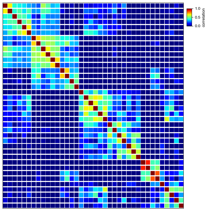
Dot Heatmap
Plot traditional heatmap using square marker marker='s'
[13]:
plt.figure(figsize=(8,8))
cm = DotClustermapPlotter(data=corr_mat,x='level_0',y='level_1',value='correlation',
              c='correlation',cmap='jet',vmax=1,vmin=0,s=0.7,marker='s',spines=True)
cm.ax_heatmap.grid(which='minor',color='white',linestyle='--',linewidth=1)
plt.show()
Starting..
Calculating row orders..
Reordering rows..
Calculating col orders..
Reordering cols..
Plotting matrix..
Inferred max_s (max size of scatter point) is: 132.808800071564
Collecting legends..
Plotting legends..
Estimated legend width: 7.5 mm
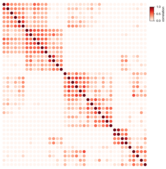
Simple dot heatmap using fixed dot size
In default, using circle marker: marker='o'
[14]:
plt.figure(figsize=(8,8))
cm = DotClustermapPlotter(corr_mat,x='level_0',y='level_1',value='correlation',
                          c='correlation',s=0.5,cmap='Oranges',vmax=1,vmin=0)
plt.show()
Starting..
Calculating row orders..
Reordering rows..
Calculating col orders..
Reordering cols..
Plotting matrix..
Inferred max_s (max size of scatter point) is: 132.808800071564
Collecting legends..
Plotting legends..
Estimated legend width: 7.5 mm
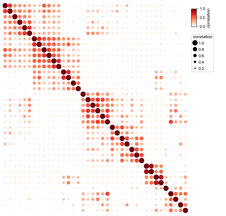
Changing the size of point
In default, we determined the size of the points based on the value col if parameter s was not given
[15]:
plt.figure(figsize=(8,8))
cm = DotClustermapPlotter(corr_mat,x='level_0',y='level_1',value='correlation',
                          s='correlation',cmap='RedYellowBlue_r',c='correlation',
                          vmax=1,vmin=0,
                          linewidth=0.5,edgecolor='black')
plt.show()
Starting..
Calculating row orders..
Reordering rows..
Calculating col orders..
Reordering cols..
Plotting matrix..
Inferred max_s (max size of scatter point) is: 132.808800071564
Collecting legends..
Plotting legends..
Estimated legend width: 28.22361111111111 mm
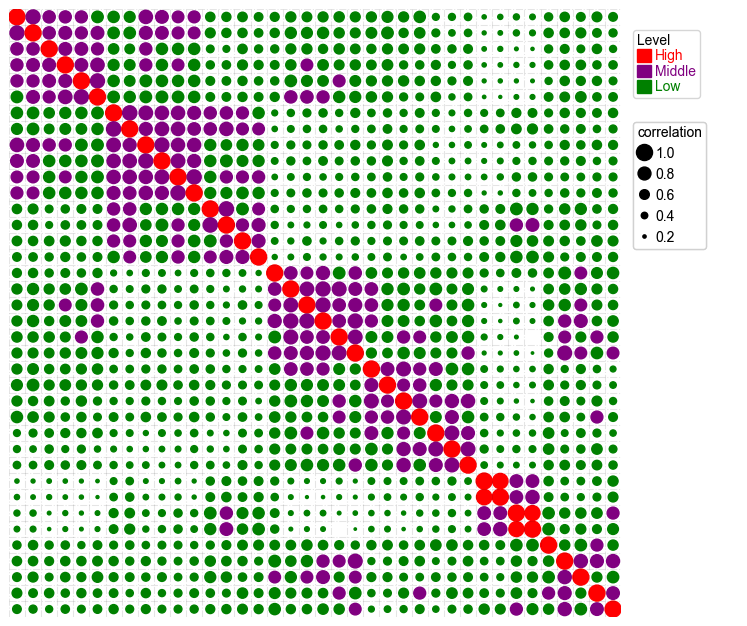
Add parameter hue and use different colors for different groups
[16]:
plt.figure(figsize=(8,8))
cm = DotClustermapPlotter(
    corr_mat,x='level_0',y='level_1',value='correlation',hue='Level',
    colors={'High':'red','Middle':'purple','Low':'green'},
    s='correlation',vmax=1,vmin=0)
plt.show()
Starting..
Calculating row orders..
Reordering rows..
Calculating col orders..
Reordering cols..
Plotting matrix..
Inferred max_s (max size of scatter point) is: 132.808800071564
Collecting legends..
Plotting legends..
Estimated legend width: 28.22361111111111 mm
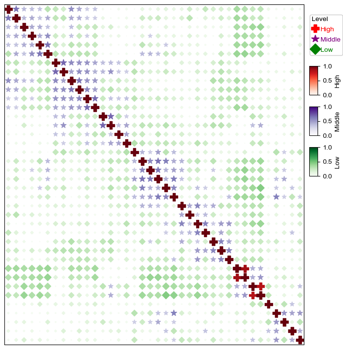
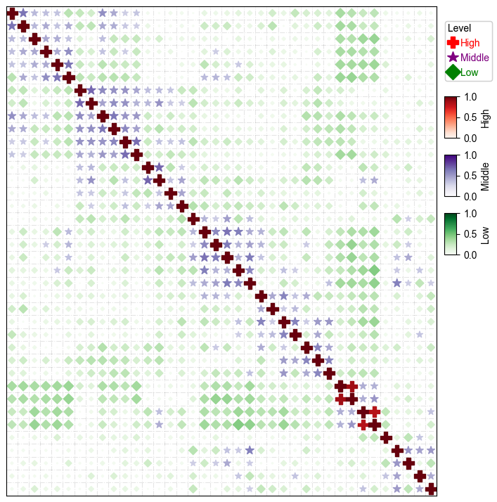
Add parameter hue and use different cmap and marker for different groups
[17]:
plt.figure(figsize=(8,8))
cm = DotClustermapPlotter(corr_mat,x='level_0',y='level_1',value='correlation',hue='Level',
              colors={'High':'red','Middle':'purple','Low':'green'}, #in this case, colors is only used to control the color in the legend
              marker={'High':'P','Middle':'*','Low':'D'},
                          spines=True,
              vmax=1,vmin=0,legend_width=18)
plt.show()
Starting..
Calculating row orders..
Reordering rows..
Calculating col orders..
Reordering cols..
Plotting matrix..
Inferred max_s (max size of scatter point) is: 132.808800071564
Collecting legends..
Plotting legends..
[18]:
plt.figure(figsize=(8,8))
cm = DotClustermapPlotter(corr_mat,x='level_0',y='level_1',value='correlation',hue='Level',
              cmap={'High':'Reds','Middle':'Purples','Low':'Greens'},
              colors={'High':'red','Middle':'purple','Low':'green'}, #in this case, colors is only used to control the color in the legend
              marker={'High':'P','Middle':'*','Low':'D'},
                          spines=True,
              vmax=1,vmin=0,legend_width=18)
plt.show()
Starting..
Calculating row orders..
Reordering rows..
Calculating col orders..
Reordering cols..
Plotting matrix..
Inferred max_s (max size of scatter point) is: 132.808800071564
Collecting legends..
Plotting legends..
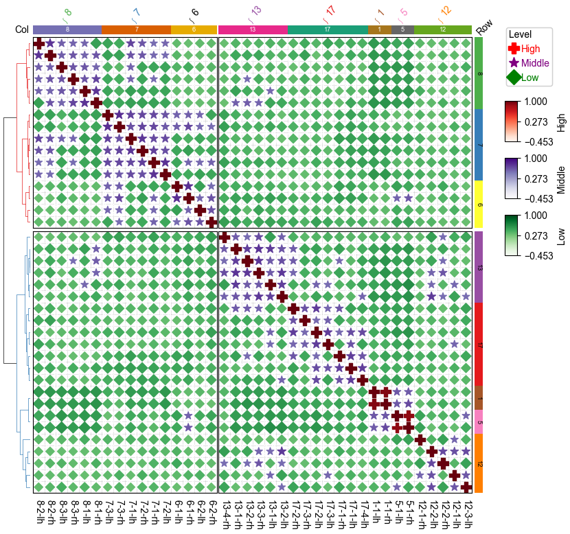
Dot Clustermap
Plot clustermap using seaborn brain networks dataset
[19]:
corr_mat.head()
[19]:
| level_0 | level_1 | correlation | Level | |
|---|---|---|---|---|
| 0 | 1-1-lh | 1-1-lh | 1.000000 | High |
| 1 | 1-1-lh | 1-1-rh | 0.881516 | High |
| 2 | 1-1-lh | 5-1-lh | 0.431619 | Middle |
| 3 | 1-1-lh | 5-1-rh | 0.418708 | Middle |
| 4 | 1-1-lh | 6-1-lh | -0.084634 | Low |
[20]:
df_row=corr_mat['level_0'].drop_duplicates().to_frame()
df_row['RowGroup']=df_row.level_0.apply(lambda x:x.split('-')[0])
df_row.set_index('level_0',inplace=True)

df_col=corr_mat['level_1'].drop_duplicates().to_frame()
df_col['ColGroup']=df_col.level_1.apply(lambda x:x.split('-')[0])
df_col.set_index('level_1',inplace=True)

print(df_row.head())
print(df_col.head())
        RowGroup
level_0
1-1-lh         1
1-1-rh         1
5-1-lh         5
5-1-rh         5
6-1-lh         6
        ColGroup
level_1
1-1-lh         1
1-1-rh         1
5-1-lh         5
5-1-rh         5
6-1-lh         6
[21]:
row_ha = HeatmapAnnotation(Row=anno_simple(df_row.RowGroup,cmap='Set1',
                                           add_text=True,text_kws={'color':'black','rotation':-90},
                                          legend=False),
                           axis=0,verbose=0,label_kws={'rotation':45,'horizontalalignment':'left'})

col_ha = HeatmapAnnotation(label=anno_label(df_col.ColGroup, merge=True,rotation=45),
                           Col=anno_simple(df_col.ColGroup,cmap='Dark2',legend=False,add_text=True),
                           verbose=0,label_side='left',label_kws={'horizontalalignment':'right'})

plt.figure(figsize=(9, 8))
cm = DotClustermapPlotter(data=corr_mat, x='level_0',y='level_1',value='correlation',
                          hue='Level', cmap={'High':'Reds','Middle':'Purples','Low':'Greens'},
                          colors={'High':'red','Middle':'purple','Low':'green'},
                          marker={'High':'P','Middle':'*','Low':'D'},
                          top_annotation=col_ha,right_annotation=row_ha,
                          col_split=2,row_split=2, col_split_gap=0.5,row_split_gap=1,
                          show_rownames=True,show_colnames=True,row_dendrogram=True,
                          tree_kws={'row_cmap': 'Set1'},verbose=0,legend_vgap=7,spines=True,)
plt.show()
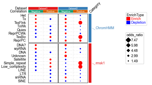
Visualize up to five dimension data using DotClustermapPlotter
Plot enrichment analysis result using example dataset with samples annotations
[22]:
data=pd.read_csv("../data/kycg_result.txt",sep='\t')
data=data.loc[data.Category.isin(['rmsk1','ChromHMM','EnsRegBuild'])]
data.SampleID.replace({'Clark2018_Argelaguet2019':'Dataset1','Luo2022':'Dataset2'},inplace=True)
max_p=np.nanmax(data['-log10(Pval)'].values)
data['-log10(Pval)'].fillna(max_p,inplace=True)
data['ID']=data.SampleID + '-' + data.CpGType
vc=data.groupby('Term').SampleID.apply(lambda x:x.nunique())

data=data.loc[data.Term.isin(vc[vc>=2].index.tolist())]
# p_max=data['-log10(Pval)'].max()
# p_min=data['-log10(Pval)'].min()
# data['-log10(Pval)']=data['-log10(Pval)'].apply(lambda x:(x-p_min)/(p_max-p_min))
df_col=data.ID.drop_duplicates().to_frame()
df_col['Dataset']=df_col.ID.apply(lambda x:x.split('-')[0])
df_col['Correlation']=df_col.ID.apply(lambda x:x.split('-')[1])
df_col.set_index('ID',inplace=True)
df_row=data.loc[:,['Term','Category']].drop_duplicates()
df_row.set_index('Term',inplace=True)
[23]:
data.head()
[23]:
| Term | odds_ratio | Category | SampleID | CpGType | pvalue | EnrichType | -log10(Pval) | ID | |
|---|---|---|---|---|---|---|---|---|---|
| 49 | Het | 1.061 | ChromHMM | Dataset1 | Negative | 2.020000e-07 | Enrich | 26.0 | Dataset1-Negative |
| 55 | Tx | 1.029 | ChromHMM | Dataset1 | Negative | 4.580000e-07 | Enrich | 26.0 | Dataset1-Negative |
| 65 | TssFlnk | 1.056 | ChromHMM | Dataset1 | Negative | 2.370000e-06 | Enrich | 26.0 | Dataset1-Negative |
| 112 | TxWk | 1.022 | ChromHMM | Dataset1 | Negative | 8.660000e-05 | Enrich | 26.0 | Dataset1-Negative |
| 346 | DNA? | 1.350 | rmsk1 | Dataset1 | Negative | 2.760000e-02 | Enrich | 26.0 | Dataset1-Negative |
[24]:
data['-log10(Pval)'].describe()
[24]:
count    64.000000
mean     25.356918
std       3.632073
min       3.119186
25%      26.000000
50%      26.000000
75%      26.000000
max      26.000000
Name: -log10(Pval), dtype: float64
[25]:
print(data.CpGType.unique())
print(data.EnrichType.unique())
['Negative' 'Positive']
['Enrich' 'Depletion']
[26]:
df_col
[26]:
| Dataset | Correlation | |
|---|---|---|
| ID | ||
| Dataset1-Negative | Dataset1 | Negative |
| Dataset1-Positive | Dataset1 | Positive |
| Dataset2-Negative | Dataset2 | Negative |
| Dataset2-Positive | Dataset2 | Positive |
[27]:
df_row
[27]:
| Category | |
|---|---|
| Term | |
| Het | ChromHMM |
| Tx | ChromHMM |
| TssFlnk | ChromHMM |
| TxWk | ChromHMM |
| DNA? | rmsk1 |
| srpRNA | rmsk1 |
| DNA | rmsk1 |
| Unknown | rmsk1 |
| Satellite | rmsk1 |
| Simple_repeat | rmsk1 |
| Low_complexity | rmsk1 |
| LINE | rmsk1 |
| Quies | ChromHMM |
| ReprPCWk | ChromHMM |
| TssBiv | ChromHMM |
| ReprPC | ChromHMM |
| LTR | rmsk1 |
| snRNA | rmsk1 |
| SINE | rmsk1 |
[28]:
row_ha = HeatmapAnnotation(
                           Category=anno_simple(df_row.Category,cmap='Set1',
                                           add_text=False,legend=False),
                           label=anno_label(df_row.Category, merge=True,rotation=0),
                           axis=0,verbose=0,label_kws={'rotation':45,'horizontalalignment':'left'})

col_ha = HeatmapAnnotation(
                           Dataset=anno_simple(df_col.Dataset,cmap='Set1',legend=False,add_text=True),
                           Correlation=anno_simple(df_col.Correlation,cmap='Dark2',legend=False,add_text=True),
                           verbose=0,label_side='left',label_kws={'horizontalalignment':'right'})

plt.figure(figsize=(3, 5))
cm = DotClustermapPlotter(data=data, x='ID',y='Term',value='-log10(Pval)',c='-log10(Pval)',s='odds_ratio',
                          hue='EnrichType', row_cluster=False,col_cluster=False,
                          cmap={'Enrich':'RdYlGn_r','Depletion':'coolwarm_r'},
                          colors={'Enrich':'red','Depletion':'blue'},
                          #marker={'Enrich':'^','Depletion':'v'},
                          top_annotation=col_ha,right_annotation=row_ha,
                          col_split=df_col.Dataset,row_split=df_row.Category, col_split_gap=0.5,row_split_gap=1,
                          show_rownames=True,show_colnames=False,row_dendrogram=False,
                          verbose=1,legend_vgap=7) #if the size of dot in legend is too large, use alpha to control, for example: alpha=0.8
plt.savefig("dotHeatmap1.pdf",bbox_inches='tight')
plt.show()
Starting..
Calculating row orders..
Reordering rows..
Calculating col orders..
Reordering cols..
Plotting matrix..
Inferred max_s (max size of scatter point) is: 180.09263168093761
Collecting legends..
Plotting legends..
Estimated legend width: 25.930555555555557 mm
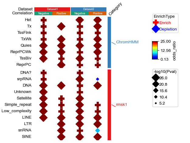
[29]:
plt.figure(figsize=(3.5, 5))
cm = DotClustermapPlotter(data=data, x='ID',y='Term',value='odds_ratio',s='-log10(Pval)',
                          hue='EnrichType', row_cluster=False,#cmap='jet',
                          colors={'Enrich':'red','Depletion':'blue'},c='-log10(Pval)',
                          cmap={'Enrich':'Reds','Depletion':'Blues'},
                          marker={'Enrich':'$\\ast$','Depletion':'X'},value_na=25,c_na=25,
                          top_annotation=col_ha,right_annotation=row_ha,
                          col_split=df_col.Dataset,row_split=df_row.Category, col_split_gap=0.5,row_split_gap=1,
                          show_rownames=True,verbose=1,legend_vgap=7,dot_legend_marker='o')
# plt.savefig(os.path.expanduser("~/Gallery/20230227_kycg.pdf"),bbox_inches='tight')
plt.show()
Starting..
Calculating row orders..
Reordering rows..
Calculating col orders..
Reordering cols..
Plotting matrix..
Inferred max_s (max size of scatter point) is: 180.09263168093761
Collecting legends..
Plotting legends..
Estimated legend width: 30.516666666666666 mm
[30]:
data['-log10(Pval)'].describe()
[30]:
count    64.000000
mean     25.356918
std       3.632073
min       3.119186
25%      26.000000
50%      26.000000
75%      26.000000
max      26.000000
Name: -log10(Pval), dtype: float64
[31]:
plt.figure(figsize=(3.5, 4))
cm = DotClustermapPlotter(data=data, x='ID',y='Term',value='-log10(Pval)',c='-log10(Pval)',s='odds_ratio',
                          hue='EnrichType', row_cluster=False,col_cluster=False,cmap='jet',
                          colors={'Enrich':'red','Depletion':'blue'},
                          # marker={'Enrich':'P','Depletion':'*'},
                          value_na=25,c_na=25,
                          top_annotation=col_ha,right_annotation=row_ha,
                          col_split=df_col.Dataset,row_split=df_row.Category, col_split_gap=0.5,row_split_gap=1,
                          show_rownames=True,verbose=1,legend_vgap=7,spines=True,dot_legend_marker='D')
plt.show()
Starting..
Calculating row orders..
Reordering rows..
Calculating col orders..
Reordering cols..
Plotting matrix..
Inferred max_s (max size of scatter point) is: 110.41377726332676
Collecting legends..
Plotting legends..
Estimated legend width: 25.930555555555557 mm