[5]:
import os,sys
%matplotlib inline
import matplotlib.pylab as plt
import pickle
import numpy as np
plt.rcParams['figure.dpi'] = 100
plt.rcParams['savefig.dpi']=300
sys.path.append(os.path.expanduser("~/Projects/Github/PyComplexHeatmap"))
import PyComplexHeatmap
print(PyComplexHeatmap.__version__)
from PyComplexHeatmap import *
1.7.7.dev0+gddb18da.d20240909
[6]:
#set font to Arial using the following code
plt.rcParams['font.family']='sans serif'
plt.rcParams['font.sans-serif']='Arial'
# set pdf.fonttype to 42
plt.rcParams['pdf.fonttype']=42
Understand the layout:
[3]:
#Generate example dataset (random)
df = pd.DataFrame(['GroupA'] * 5 + ['GroupB'] * 5, columns=['AB'])
df['CD'] = ['C'] * 3 + ['D'] * 3 + ['G'] * 4
df['EF'] = ['E'] * 6 + ['F'] * 2 + ['H'] * 2
df['F'] = np.random.normal(0, 1, 10)
df.index = ['sample' + str(i) for i in range(1, df.shape[0] + 1)]
df_box = pd.DataFrame(np.random.randn(10, 4), columns=['Gene' + str(i) for i in range(1, 5)])
df_box.index = ['sample' + str(i) for i in range(1, df_box.shape[0] + 1)]
df_bar = pd.DataFrame(np.random.uniform(0, 10, (10, 2)), columns=['TMB1', 'TMB2'])
df_bar.index = ['sample' + str(i) for i in range(1, df_box.shape[0] + 1)]
df_scatter = pd.DataFrame(np.random.uniform(0, 10, 10), columns=['Scatter'])
df_scatter.index = ['sample' + str(i) for i in range(1, df_box.shape[0] + 1)]
df_heatmap = pd.DataFrame(np.random.randn(30, 10), columns=['sample' + str(i) for i in range(1, 11)])
df_heatmap.index = ["Fea" + str(i) for i in range(1, df_heatmap.shape[0] + 1)]
df_heatmap.iloc[1, 2] = np.nan
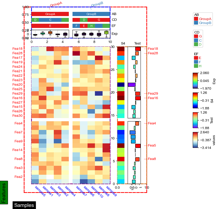
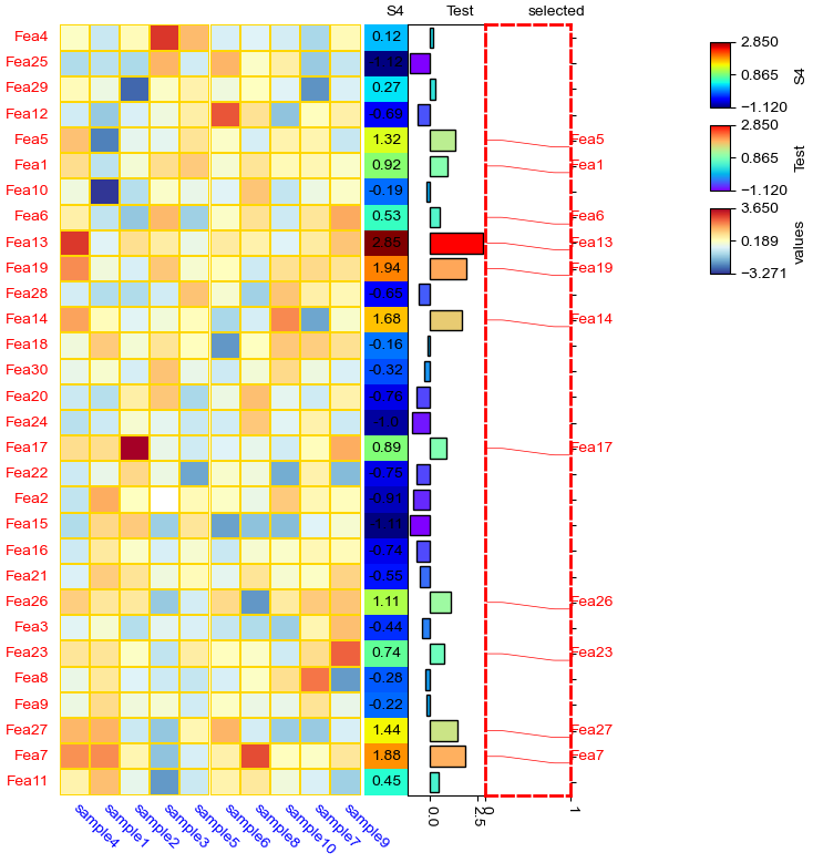
[4]:
#Annotate the rows with average > 0.3
df_rows = df_heatmap.apply(lambda x:x.name if x.sample4 > 0.5 else None,axis=1)
df_rows=df_rows.to_frame(name='Selected')
df_rows['XY']=df_rows.index.to_series().apply(lambda x:'A' if int(x.replace('Fea',''))>=15 else 'B')

row_ha = HeatmapAnnotation(
            S4=anno_simple(df_heatmap.sample4.apply(lambda x:round(x,2)),
                       height=10,#add_text=True,
                       text_kws={'rotation':0,'fontsize':10,'color':'black'}),
            Test=anno_barplot(df_heatmap.sample4.apply(lambda x:round(x,2)),
                        height=18,cmap='rainbow'),
            selected=anno_label(df_rows,colors='red',relpos=(0,0.5)),
            axis=0,verbose=0,wgap=4,label_kws={'rotation':0,'horizontalalignment':'left',
                                        'verticalalignment':'bottom'})

col_ha = HeatmapAnnotation(
            label=anno_label(df.AB, merge=True,rotation=15),
            AB=anno_simple(df.AB,add_text=True,height=5),axis=1,
            CD=anno_simple(df.CD,add_text=True,height=5),
            EF=anno_simple(df.EF,add_text=True,height=5,
                            legend_kws={'frameon':False}),
            Exp=anno_boxplot(df_box, cmap='turbo',grid=True),
            verbose=0,hgap=2) #verbose=0 will turn off the log.

plt.figure(figsize=(6, 8))
cm = ClusterMapPlotter(
            data=df_heatmap, top_annotation=col_ha,right_annotation=row_ha,
            col_split=df.AB,
            row_split=df_rows.XY,
            col_split_gap=3.5,row_split_gap=2.5,
            col_cluster=True,row_cluster=True,
            label='values',row_dendrogram=False,
            show_rownames=True,show_colnames=True,
            verbose=0,legend_gap=5,legend_hpad=10,legend_vpad=5,
            #annot=True,fmt='.1g',linewidths=0.05,linecolor='gold',
            cmap='RdYlBu_r',
            xticklabels_kws={'labelrotation':-45,'labelcolor':'blue'},
            yticklabels_kws=dict(labelcolor='red',pad=20),
            subplot_gap=8,
            xlabel='Samples',xlabel_kws=dict(color='white',fontsize=14,labelpad=25,position=(0,0)),
            xlabel_bbox_kws=dict(facecolor='black'),ylabel_bbox_kws=dict(facecolor='green'),
            ylabel='Features',ylabel_kws=dict(color='black',fontsize=14,labelpad=45,position=(0,0)),
)
for ax,color in zip([cm.ax,cm.ax_heatmap,cm.ax_top,cm.ax_right],['red','purple','blue','chocolate']):
    for side in ["top", "right", "left", "bottom"]:
        ax.set_axis_on()
        # ax.yaxis.set_visible(True)
        # ax.xaxis.set_visible(True)
        ax.spines[side].set_visible(True)
        ax.spines[side].set_color(color)
        ax.spines[side].set_linewidth(2)
        ax.spines[side].set_linestyle('--')
plt.show()
[5]:
cm.ax.xaxis.label.properties()
[5]:
{'agg_filter': None,
 'alpha': None,
 'animated': False,
 'bbox_patch': <matplotlib.patches.FancyBboxPatch at 0x7fb4d5a69fa0>,
 'children': [],
 'clip_box': None,
 'clip_on': True,
 'clip_path': None,
 'color': 'white',
 'figure': <Figure size 600x800 with 31 Axes>,
 'fontfamily': ['sans serif'],
 'fontname': 'Arial',
 'fontproperties': <matplotlib.font_manager.FontProperties at 0x7fb4d59faee0>,
 'fontsize': 14.0,
 'fontstyle': 'normal',
 'fontvariant': 'normal',
 'fontweight': 'normal',
 'gid': None,
 'horizontalalignment': 'center',
 'in_layout': True,
 'label': '',
 'math_fontfamily': 'dejavusans',
 'mouseover': False,
 'parse_math': True,
 'path_effects': [],
 'picker': None,
 'position': (0, 23.000000000000007),
 'rasterized': False,
 'rotation': 0.0,
 'rotation_mode': None,
 'sketch_params': None,
 'snap': None,
 'stretch': 'normal',
 'text': 'Samples',
 'tightbbox': Bbox([[37.125, 5.000000000000007], [112.875, 23.000000000000007]]),
 'transform': <matplotlib.transforms.BlendedAffine2D at 0x7fb4d59faf70>,
 'transform_rotates_text': False,
 'transformed_clip_path_and_affine': (None, None),
 'unitless_position': (0.0, 23.000000000000007),
 'url': None,
 'usetex': False,
 'verticalalignment': 'top',
 'visible': True,
 'window_extent': Bbox([[37.125, 5.000000000000007], [112.875, 23.000000000000007]]),
 'wrap': False,
 'zorder': 3}
[6]:
cm.ax.xaxis.label.get_bbox_patch().properties()
[6]:
{'agg_filter': None,
 'alpha': None,
 'animated': False,
 'antialiased': True,
 'bbox': Bbox([[0.0, 0.0], [75.75, 18.0]]),
 'boxstyle': <matplotlib.patches.BoxStyle.Square at 0x7fb4d5f01b20>,
 'capstyle': 'butt',
 'children': [],
 'clip_box': None,
 'clip_on': True,
 'clip_path': None,
 'data_transform': <matplotlib.transforms.Affine2D at 0x7fb4d69d2430>,
 'edgecolor': (0.0, 0.0, 0.0, 1.0),
 'extents': Bbox([[47.54166666666667, -0.6388888888888813], [134.56944444444446, 28.638888888888896]]),
 'facecolor': (0.0, 0.0, 0.0, 1.0),
 'figure': None,
 'fill': True,
 'gid': None,
 'hatch': None,
 'height': 18.0,
 'in_layout': True,
 'joinstyle': 'miter',
 'label': '',
 'linestyle': 'solid',
 'linewidth': 1.0,
 'mouseover': False,
 'mutation_aspect': 1,
 'mutation_scale': 19.444444444444443,
 'patch_transform': <matplotlib.transforms.IdentityTransform at 0x7fb4d59874c0>,
 'path': Path(array([[-5.63888889, -5.63888889],
        [81.38888889, -5.63888889],
        [81.38888889, 23.63888889],
        [-5.63888889, 23.63888889],
        [-5.63888889, -5.63888889]]), array([ 1,  2,  2,  2, 79], dtype=uint8)),
 'path_effects': [],
 'picker': None,
 'rasterized': False,
 'sketch_params': None,
 'snap': None,
 'tightbbox': Bbox([[47.54166666666667, -0.6388888888888813], [134.56944444444446, 28.638888888888896]]),
 'transform': <matplotlib.transforms.Affine2D at 0x7fb4d69d2430>,
 'transformed_clip_path_and_affine': (None, None),
 'url': None,
 'verts': array([[ 47.54166667,  -0.63888889],
        [134.56944444,  -0.63888889],
        [134.56944444,  28.63888889],
        [ 47.54166667,  28.63888889],
        [ 47.54166667,  -0.63888889]]),
 'visible': True,
 'width': 75.75,
 'window_extent': Bbox([[47.54166666666667, -0.6388888888888813], [134.56944444444446, 28.638888888888896]]),
 'x': 0.0,
 'y': 0.0,
 'zorder': 1}
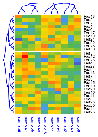
Bezier dendrogram
[3]:
df = pd.DataFrame(['GroupA'] * 5 + ['GroupB'] * 5, columns=['AB'])
df['CD'] = ['C'] * 3 + ['D'] * 3 + ['G'] * 4
df['EF'] = ['E'] * 6 + ['F'] * 2 + ['H'] * 2
df['F'] = np.random.normal(0, 1, 10)
df.index = ['sample' + str(i) for i in range(1, df.shape[0] + 1)]

df_heatmap = pd.DataFrame(np.random.randn(30, 10), columns=['sample' + str(i) for i in range(1, 11)])
df_heatmap.index = ["Fea" + str(i) for i in range(1, df_heatmap.shape[0] + 1)]
df_heatmap.iloc[1, 2] = np.nan

plt.figure(figsize=(3.5, 5))
cm = ClusterMapPlotter(
        data=df_heatmap.fillna(0),
        col_cluster=True,row_cluster=True,
        # col_split=df.AB,
        row_split=2,
        col_split_gap=0.5,row_split_gap=0.8,
        label='values',row_dendrogram=True,col_dendrogram=True,
        show_rownames=True,show_colnames=True,bezier=True,dotsize=3,
        row_names_side='right',yticklabels=True,
        tree_kws=dict(colors='blue'),verbose=0,legend_gap=5,
        cmap='meth2',xticklabels_kws={'labelrotation':-90,'labelcolor':'blue'})
plt.show()
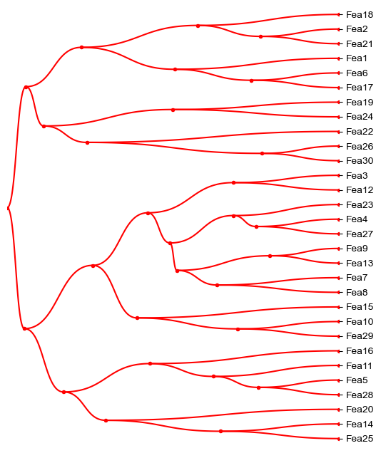
[4]:
dendrogram_row = PyComplexHeatmap.DendrogramPlotter(
                    df_heatmap.fillna(0),
                    linkage=None,
                    axis=0,
                    label=True,
                    rotate=True,
            )
[5]:
plt.figure(figsize=(6,8))
ax=plt.gca()
dendrogram_row.plot(ax=ax,bezier=True,dotsize=8,tree_kws=dict(colors='red'))
plt.savefig("test.pdf",bbox_inches='tight')
plt.show()
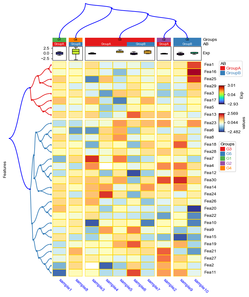
[6]:
#Generate example dataset (random)
df = pd.DataFrame(['GroupA'] * 5 + ['GroupB'] * 5, columns=['AB'])
df['CD'] = ['C'] * 3 + ['D'] * 3 + ['G'] * 4
df['EF'] = ['E'] * 6 + ['F'] * 2 + ['H'] * 2
df['F'] = np.random.normal(0, 1, 10)
df.index = ['sample' + str(i) for i in range(1, df.shape[0] + 1)]
df_box = pd.DataFrame(np.random.randn(10, 4), columns=['Gene' + str(i) for i in range(1, 5)])
df_box.index = ['sample' + str(i) for i in range(1, df_box.shape[0] + 1)]
df_bar = pd.DataFrame(np.random.uniform(0, 10, (10, 2)), columns=['TMB1', 'TMB2'])
df_bar.index = ['sample' + str(i) for i in range(1, df_box.shape[0] + 1)]
df_scatter = pd.DataFrame(np.random.uniform(0, 10, 10), columns=['Scatter'])
df_scatter.index = ['sample' + str(i) for i in range(1, df_box.shape[0] + 1)]
df_heatmap = pd.DataFrame(np.random.randn(30, 10), columns=['sample' + str(i) for i in range(1, 11)])
df_heatmap.index = ["Fea" + str(i) for i in range(1, df_heatmap.shape[0] + 1)]
df_heatmap.iloc[1, 2] = np.nan
# add a missing value to sample4
df_heatmap.loc['Fea4','sample4']=np.nan
df_box.loc['sample4','Gene4']=np.nan
df_box
[6]:
| Gene1 | Gene2 | Gene3 | Gene4 | |
|---|---|---|---|---|
| sample1 | -0.205718 | -0.946868 | 0.511483 | 0.893269 |
| sample2 | -0.077131 | -0.299588 | 0.096398 | -0.268682 |
| sample3 | 0.039453 | -1.376546 | 0.018616 | 0.393587 |
| sample4 | -0.066739 | -0.168233 | 1.930738 | NaN |
| sample5 | 0.980476 | 1.017062 | -1.141064 | 1.709422 |
| sample6 | 0.189646 | 0.815627 | -0.542022 | -0.414366 |
| sample7 | 1.318299 | -0.144643 | 0.068143 | 1.429474 |
| sample8 | 3.010217 | -2.927032 | 1.681276 | 0.475914 |
| sample9 | -0.066108 | -0.873660 | -0.553423 | 0.567739 |
| sample10 | 0.179432 | -0.391544 | 0.152426 | 1.488862 |
[7]:
df['Groups']=['G1']+['G2']+['G3']*5+['G4']+['G5']*2
col_ha = HeatmapAnnotation(
            Groups=anno_simple(df.Groups,add_text=True,text_kws={'color':'black'}),
            AB=anno_simple(df.AB,add_text=True),axis=1,
            Exp=anno_boxplot(df_box, cmap='turbo'),
            verbose=0) #verbose=0 will turn off the log.
plt.figure(figsize=(8, 10))
cm = ClusterMapPlotter(
        data=df_heatmap, top_annotation=col_ha,
        col_split=df.Groups, col_split_order="cluster_between_groups",
        col_split_gap=2,col_cluster=False,
        row_cluster=True,col_dendrogram=True,row_dendrogram_size=35,col_dendrogram_size=25,
        row_split=2,row_split_gap=1,row_dendrogram=True,
        label='values',show_rownames=True,show_colnames=True,bezier=True,dotsize=8,
        tree_kws={'colors':'blue','row_cmap':'Set1','col_cmap':'Paired'},
        verbose=0,legend_gap=7,
        linewidths=0.05,linecolor='gold',cmap='RdYlBu_r',
        xticklabels_kws={'labelrotation':-45,'labelcolor':'blue'},
        ylabel='Features')
plt.savefig("test2.pdf") #bbox_inches='tight'
plt.show()
anno_label
[12]:
#Generate example dataset (random)
df = pd.DataFrame(['GroupA'] * 5 + ['GroupB'] * 5, columns=['AB'])
df['CD'] = ['C'] * 3 + ['D'] * 3 + ['G'] * 4
df['EF'] = ['E'] * 6 + ['F'] * 2 + ['H'] * 2
df['F'] = np.random.normal(0, 1, 10)
df.index = ['sample' + str(i) for i in range(1, df.shape[0] + 1)]
df_box = pd.DataFrame(np.random.randn(10, 4), columns=['Gene' + str(i) for i in range(1, 5)])
df_box.index = ['sample' + str(i) for i in range(1, df_box.shape[0] + 1)]
df_bar = pd.DataFrame(np.random.uniform(0, 10, (10, 2)), columns=['TMB1', 'TMB2'])
df_bar.index = ['sample' + str(i) for i in range(1, df_box.shape[0] + 1)]
df_scatter = pd.DataFrame(np.random.uniform(0, 10, 10), columns=['Scatter'])
df_scatter.index = ['sample' + str(i) for i in range(1, df_box.shape[0] + 1)]
df_heatmap = pd.DataFrame(np.random.randn(30, 10), columns=['sample' + str(i) for i in range(1, 11)])
df_heatmap.index = ["Fea" + str(i) for i in range(1, df_heatmap.shape[0] + 1)]
df_heatmap.iloc[1, 2] = np.nan
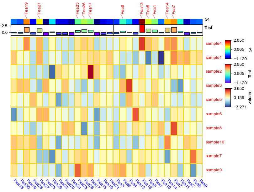
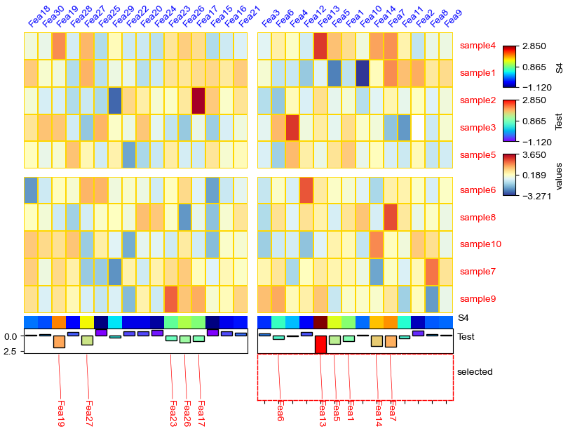
[13]:
#Annotate the rows with average > 0.3
df_rows = df_heatmap.apply(lambda x:x.name if x.sample4 > 0.5 else None,axis=1)
df_rows=df_rows.to_frame(name='Selected')
df_rows['XY']=df_rows.index.to_series().apply(lambda x:'A' if int(x.replace('Fea',''))>=15 else 'B')

row_ha = HeatmapAnnotation(
            S4=anno_simple(df_heatmap.sample4.apply(lambda x:round(x,2)),
                       add_text=True,height=10,
                       text_kws={'rotation':0,'fontsize':10,'color':'black'}),
            # Scatter=anno_scatterplot(df_heatmap.sample4.apply(lambda x:round(x,2)),
            #                  height=10),
            Test=anno_barplot(df_heatmap.sample4.apply(lambda x:round(x,2)),
                        height=18,cmap='rainbow'),
            selected=anno_label(df_rows,colors='red',height=20,extend=True),
            axis=0,verbose=0,#wgap=4,
            label_kws={'rotation':0,'horizontalalignment':'left',
                                        'verticalalignment':'bottom'})

plt.figure(figsize=(6, 8))
cm = ClusterMapPlotter(
            data=df_heatmap,right_annotation=row_ha,
            col_split=df.AB,
            # row_split=df_rows.XY,
            #col_split_gap=3.5,row_split_gap=2.5,
            col_cluster=True,row_cluster=True,
            label='values',row_dendrogram=False,
            show_rownames=True,show_colnames=True,
            verbose=0,legend_gap=5,#legend_hpad=10,legend_vpad=5,
            linewidths=0.05,linecolor='gold',cmap='RdYlBu_r',
            xticklabels_kws={'labelrotation':-45,'labelcolor':'blue'},
            yticklabels_kws=dict(labelcolor='red'),#subplot_gap=8
)
ax=cm.right_annotation.annotations[2].ax
for side in ["top", "right", "left", "bottom"]:
    ax.set_axis_on()
    ax.spines[side].set_visible(True)
    ax.spines[side].set_color('red')
    ax.spines[side].set_linewidth(2)
    ax.spines[side].set_linestyle('--')
ax.tick_params(axis="y", which="both", bottom=True, labelbottom=True,left=False,labelleft=False,right=True,labelright=True)
ax.yaxis.tick_right()
ax.yaxis.set_visible(True)
plt.show()
[14]:
row_ha = HeatmapAnnotation(
            selected=anno_label(df_rows,colors='red',height=20),
            Test=anno_barplot(df_heatmap.sample4.apply(lambda x:round(x,2) if x > 0 else None),
                        height=30,cmap='rainbow'),
            axis=0,verbose=0,#wgap=4,
            label_kws={'rotation':0,'horizontalalignment':'left',
                                        'verticalalignment':'bottom'})

plt.figure(figsize=(6, 8))
cm = ClusterMapPlotter(
            data=df_heatmap, left_annotation=row_ha,
            col_split=df.AB,
            row_split=df_rows.XY,
            #col_split_gap=3.5,row_split_gap=2.5,
            col_cluster=True,row_cluster=True,
            label='values',row_dendrogram=False,
            show_rownames=True,show_colnames=True,row_names_side='right',
            verbose=0,legend_gap=5,#legend_hpad=10,legend_vpad=5,
            linewidths=0.05,linecolor='gold',cmap='RdYlBu_r',
            xticklabels_kws={'labelrotation':-45,'labelcolor':'blue'},
            yticklabels_kws=dict(labelcolor='red'),#subplot_gap=8
)
for ax in cm.left_annotation.axes.flatten():
    for side in ["top", "right", "left", "bottom"]:
        ax.set_axis_on()
        ax.spines[side].set_visible(True)
        ax.spines[side].set_color('red')
        ax.spines[side].set_linewidth(1)
        ax.spines[side].set_linestyle('--')
plt.show()
[15]:
row_ha = HeatmapAnnotation(
            selected=anno_label(df_rows,colors='red',rotation=90),
            S4=anno_simple(df_heatmap.sample4.apply(lambda x:round(x,2)),
                       height=4),
            Test=anno_barplot(df_heatmap.sample4.apply(lambda x:round(x,2)),
                        height=8,cmap='rainbow'),
            axis=1,verbose=0,#wgap=4,
            label_kws={'rotation':0,'horizontalalignment':'left',
                                        'verticalalignment':'bottom'})

plt.figure(figsize=(8, 6))
cm = ClusterMapPlotter(
            data=df_heatmap.T, top_annotation=row_ha,
            row_split=df.AB,
            col_split=df_rows.XY,
            #col_split_gap=3.5,row_split_gap=2.5,
            col_cluster=True,row_cluster=True,
            label='values',row_dendrogram=False,
            show_rownames=True,show_colnames=True,row_names_side='right',
            verbose=0,legend_gap=5,#legend_hpad=10,legend_vpad=5,
            linewidths=0.05,linecolor='gold',cmap='RdYlBu_r',
            xticklabels_kws={'labelrotation':-45,'labelcolor':'blue'},
            yticklabels_kws=dict(labelcolor='red'),#subplot_gap=8
)
plt.show()
[16]:
col_ha = HeatmapAnnotation(
            S4=anno_simple(df_heatmap.sample4.apply(lambda x:round(x,2)),
                       height=4),
            Test=anno_barplot(df_heatmap.sample4.apply(lambda x:round(x,2)),
                        height=8,cmap='rainbow'),
            selected=anno_label(df_rows,colors='red',relpos=(0.7,1),height=15,extend=True),
            axis=1,verbose=0,#wgap=4,
            label_kws={'rotation':0,'horizontalalignment':'left',
                                        'verticalalignment':'bottom'})

plt.figure(figsize=(8, 6))
cm = ClusterMapPlotter(
            data=df_heatmap.T, bottom_annotation=col_ha,
            row_split=df.AB,
            col_split=df_rows.XY,
            col_split_gap=3.5,row_split_gap=2.5,
            col_cluster=True,row_cluster=True,
            label='values',row_dendrogram=False,
            show_rownames=True,show_colnames=True,row_names_side='right',
            verbose=0,legend_gap=5,#legend_hpad=10,legend_vpad=5,
            linewidths=0.05,linecolor='gold',cmap='RdYlBu_r',
            xticklabels_kws={'labelrotation':45,'labelcolor':'blue'},
            yticklabels_kws=dict(labelcolor='red'),#subplot_gap=8
)
ax=cm.bottom_annotation.annotations[2].ax
for side in ["top", "right", "left", "bottom"]:
    ax.set_axis_on()
    ax.spines[side].set_visible(True)
    ax.spines[side].set_color('red')
    ax.spines[side].set_linewidth(1)
    ax.spines[side].set_linestyle('--')
plt.show()
anno_img
[17]:
import matplotlib.image as mpimg
img=mpimg.imread("1.jpeg")
# img=mpimg.imread("2.png")
plt.imshow(img)
print(img.shape)
print(img.T.shape)
(256, 256, 3)
(3, 256, 256)
[18]:
import PIL
import requests
from io import BytesIO
url="https://motifcollections.aertslab.org/v10nr_clust/logos/taipale_cyt_meth__POU5F1_NYTAATTATGCGNRN_FL_meth_repr.png"
response = requests.get(url)
# Open the image from bytes
image = PIL.Image.open(BytesIO(response.content))
# image=PIL.ImageOps.invert(image)
if image.mode != 'RGBA':
    image = image.convert('RGB')
print(image.height,image.width)
image = np.array(image)
plt.imshow(image)
print(image.shape)
print(image.T.shape)
199 399
(199, 399, 3)
(3, 399, 199)
extent
[19]:
img=mpimg.imread("2.png")
plt.xlim(0,500)
plt.ylim(0,300)
plt.imshow(img,extent=[0,240,0,250])
ax=plt.gca()
# ax.invert_yaxis()
print(img.shape)
print(img.T.shape)
(199, 399, 4)
(4, 399, 199)
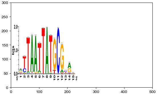
Direction of imshow: top -> bottom, left -> right The first dimension (height) is Y, the second dimension is X (width)
[20]:
df = pd.DataFrame(['AAAA1'] * 5 + ['BBBBB2'] * 5, columns=['AB'])
df['CD'] = ['C'] * 3 + ['D'] * 3 + ['G'] * 4
df['F'] = np.random.normal(0, 1, 10)
df.index = ['sample' + str(i) for i in range(1, df.shape[0] + 1)]
df_box = pd.DataFrame(np.random.randn(10, 4), columns=['Gene' + str(i) for i in range(1, 5)])
df_box.index = ['sample' + str(i) for i in range(1, df_box.shape[0] + 1)]
df_bar = pd.DataFrame(np.random.uniform(0, 10, (10, 2)), columns=['TMB1', 'TMB2'])
df_bar.index = ['sample' + str(i) for i in range(1, df_box.shape[0] + 1)]
df_scatter = pd.DataFrame(np.random.uniform(0, 10, 10), columns=['Scatter'])
df_scatter.index = ['sample' + str(i) for i in range(1, df_box.shape[0] + 1)]
df_bar1 = pd.DataFrame(np.random.uniform(0, 10, (10, 2)), columns=['T1-A', 'T1-B'])
df_bar1.index = ['sample' + str(i) for i in range(1, df_box.shape[0] + 1)]
df_bar2 = pd.DataFrame(np.random.uniform(0, 10, (10, 2)), columns=['T2-A', 'T2-B'])
df_bar2.index = ['sample' + str(i) for i in range(1, df_box.shape[0] + 1)]
df_bar3 = pd.DataFrame(np.random.uniform(0, 10, (10, 2)), columns=['T3-A', 'T3-B'])
df_bar3.index = ['sample' + str(i) for i in range(1, df_box.shape[0] + 1)]
df_bar3.iloc[5,0]=np.nan
df_bar4 = pd.DataFrame(np.random.uniform(0, 10, (10, 1)), columns=['T4'])
df_bar4.index = ['sample' + str(i) for i in range(1, df_box.shape[0] + 1)]
df_bar4.iloc[7,0]=np.nan
df_img = pd.DataFrame(
    ['https://upload.wikimedia.org/wikipedia/commons/thumb/c/c3/Python-logo-notext.svg/121px-Python-logo-notext.svg.png',
   'https://motifcollections.aertslab.org/v10nr_clust/logos/metacluster_135.7.png',
   'https://cdn3.iconfinder.com/data/icons/family-member-flat-happy-family-day/512/Brother-512.png',
   'https://cdn3.iconfinder.com/data/icons/family-member-flat-happy-family-day/512/Sister-512.png',
   'https://img.freepik.com/free-vector/sticker-design-with-cute-mouse-isolated_1308-59360.jpg',
   'https://motifcollections.aertslab.org/v10nr_clust/logos/metacluster_131.8.png',
   'https://img.freepik.com/premium-vector/vector-illustration-gorilla-isolated-white-background-cartoon-style_1151-66575.jpg',
  "2.png",'1.jpeg',
  'https://upload.wikimedia.org/wikipedia/commons/thumb/c/c3/Python-logo-notext.svg/121px-Python-logo-notext.svg.png'],
    columns=['path'])
# df_img = pd.DataFrame(
#     ["2.png",'1.jpeg']*5, columns=['path'])
df_img.index = ['sample' + str(i) for i in range(1, df_box.shape[0] + 1)]
[21]:
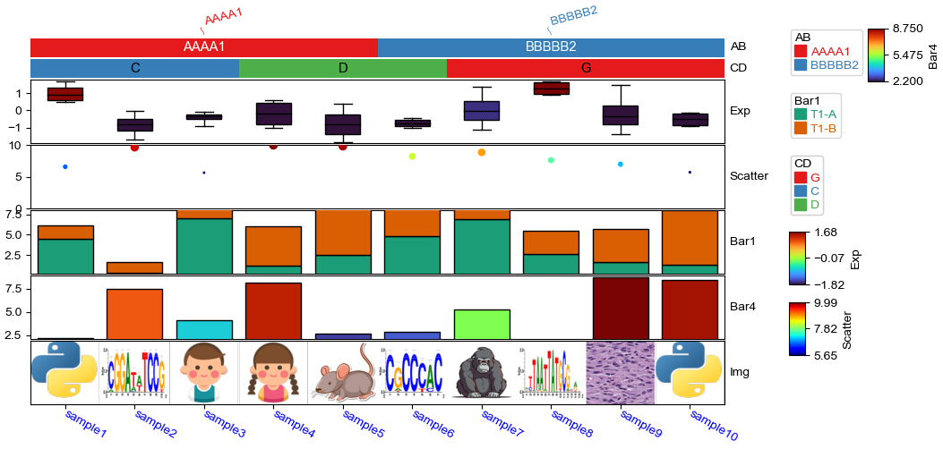
plt.figure(figsize=(10, 5))
col_ha = HeatmapAnnotation(
            label=anno_label(df.AB, merge=True,rotation=15),
            AB=anno_simple(df.AB,add_text=True,legend=True), axis=1,
            CD=anno_simple(df.CD, add_text=True,legend=True,text_kws={'color':'black'}),
            Exp=anno_boxplot(df_box, cmap='turbo',legend=True),
            Scatter=anno_scatterplot(df_scatter),
            Bar1=anno_barplot(df_bar1,legend=True,cmap='Dark2'),
            Bar4=anno_barplot(df_bar4,legend=True,cmap='turbo'),
            Img=anno_img(df_img.path),
            plot=True,legend=True,legend_gap=5,hgap=0.5)
col_ha.show_ticklabels(df.index.tolist(),fontdict={'color':'blue'},rotation=-30)
plt.show()
Starting plotting HeatmapAnnotations
Collecting annotation legends..
[22]:
plt.figure(figsize=(8, 6))
col_ha = HeatmapAnnotation(
            AB=anno_simple(df.AB,add_text=True,legend=True),
            CD=anno_simple(df.CD, add_text=True,legend=True,text_kws={'color':'black'}),
            Exp=anno_boxplot(df_box, cmap='turbo',legend=True),
            Scatter=anno_scatterplot(df_scatter),
            Bar1=anno_barplot(df_bar1,legend=True,cmap='Dark2'),
            Img=anno_img(df_img.path),
            Bar4=anno_barplot(df_bar4,legend=True,cmap='turbo'),
            plot=True,legend=True,legend_gap=5,hgap=0.5, axis=0,orientation='right',legend_hpad=15)
col_ha.show_ticklabels(df.index.tolist(),fontdict={'color':'blue'}) #rotation

ax=col_ha.annotations[-2].ax
ax.xaxis.set_visible(True) # show ticks
ax.tick_params(
    axis="x", which="both", bottom=True, labelbottom=True
)
for side in ["top", "right", "left", "bottom"]:
    ax.set_axis_on()
    ax.spines[side].set_visible(True)
    ax.spines[side].set_color('red')
    ax.spines[side].set_linewidth(1)
    ax.spines[side].set_linestyle('--')
plt.show()
Starting plotting HeatmapAnnotations
Collecting annotation legends..
[23]:
plt.figure(figsize=(8, 6))
col_ha = HeatmapAnnotation(
            Img=anno_img(df_img.path),
            AB=anno_simple(df.AB,add_text=True,legend=True),
            CD=anno_simple(df.CD, add_text=True,legend=True,text_kws={'color':'black'}),
            Exp=anno_boxplot(df_box, cmap='turbo',legend=True),
            Scatter=anno_scatterplot(df_scatter),
            Bar1=anno_barplot(df_bar1,legend=True,cmap='Dark2'),
            Bar4=anno_barplot(df_bar4,legend=True,cmap='turbo'),
            plot=True,legend=True,legend_gap=5,hgap=0.5, axis=0,orientation='left',legend_hpad=15)
col_ha.show_ticklabels(df.index.tolist(),fontdict={'color':'blue'}) #rotation
ax=col_ha.annotations[0].ax
ax.xaxis.set_visible(True) # show ticks
ax.tick_params(
    axis="x", which="both", bottom=True, labelbottom=True
)
for side in ["top", "right", "left", "bottom"]:
    ax.set_axis_on()
    ax.spines[side].set_visible(True)
    ax.spines[side].set_color('red')
    ax.spines[side].set_linewidth(1)
    ax.spines[side].set_linestyle('--')
plt.show()
Starting plotting HeatmapAnnotations
Collecting annotation legends..
Color palette design
[269]:
import matplotlib.pyplot as plt
import colorsys
import numpy as np
from matplotlib import colors as mcolors
named_colors=mcolors.CSS4_COLORS
named_colors.update(mcolors.BASE_COLORS) #kes is color string, values are hex
# named_colors.update(mcolors.TABLEAU_COLORS)
named_colors.update(mcolors.CSS4_COLORS)
for k in named_colors:
    if isinstance(named_colors[k],tuple):
        named_colors[k]=mcolors.to_hex(named_colors[k])

def identify_color_format(color):
    if color in named_colors:
        return 'named_color'
    # Check if the color is in HEX format (e.g., #RRGGBB or #RGB)
    elif isinstance(color, str) and color.startswith('#'):
        if len(color) == 7 or len(color) == 4:
            return 'HEX'
    # Check if the color is in RGB format (tuple of 3 integers/floats)
    elif isinstance(color, tuple) and len(color) == 3:
        if all(isinstance(val, int) and 0 <= val <= 255 for val in color):
            return 'RGB (integer)'
        elif all(isinstance(val, float) and 0 <= val <= 1 for val in color):
            return 'RGB (float)'
    # Check if the color is in HLS format (tuple of 3 floats)
    elif isinstance(color, tuple) and len(color) == 3:
        h, l, s = color
        if (isinstance(h, float) and 0 <= h <= 1) or (isinstance(h, int) and 0 <= h <= 360):
            if isinstance(l, float) and 0 <= l <= 1 and isinstance(s, float) and 0 <= s <= 1:
                return 'HLS'
    return 'Unknown'


def generate_similar_colors(base_color, num_colors=5, h_delta=1/6, l_delta=0.4, s_delta=0.4,
                           l_min=0.2,l_max=0.8,s_min=0.2,s_max=0.8):
    fmt=identify_color_format(base_color)
    if not fmt.startswith('RGB'):
        base_color=mcolors.to_rgb(base_color)

    # Convert the base RGB color to HLS (Hue, Lightness, Saturation)
    r, g, b = base_color
    h, l, s = colorsys.rgb_to_hls(r, g, b)

    # Generate a list of similar colors by varying the hue
    # The hue determines the "base" color:
    #     0 or 1 (or 360 degrees) = Red
    #     1/6 (or 60 degrees) = Yellow
    #     2/6 (or 120 degrees) = Green
    #     3/6 (or 180 degrees) = Cyan
    #     4/6 (or 240 degrees) = Blue
    #     5/6 (or 300 degrees) = Magenta
    #     Back to Red as it cycles around the wheel.
    colors = []
    hues=np.linspace(max(h-h_delta,0),min(h+h_delta,1),num_colors)
    lightness=np.linspace(max(l-l_delta,l_min),min(l+l_delta,l_max),num_colors)
    saturations=np.linspace(max(s-s_delta,s_min),min(s+s_delta,s_max),num_colors)
    for h1,l1,s1 in zip(hues,lightness,saturations):
        new_color = colorsys.hls_to_rgb(h1, l1, s1)
        colors.append(new_color)
    return colors

def interpolate_colors(color1, color2, num_colors,fmt='rgb'):
    if fmt=='hls':
        color1=colorsys.hls_to_rgb(*color1)
        color2=colorsys.hls_to_rgb(*color2)
    elif fmt!='rgb':
        color1=mcolors.to_rgb(color1)
        color2=mcolors.to_rgb(color2)
    # Convert colors to numpy arrays for easy interpolation
    color1 = np.array(color1)
    color2 = np.array(color2)

    # Generate a linear interpolation between the two colors
    colors = [tuple(color1 + (color2 - color1) * i / (num_colors - 1)) for i in range(num_colors)]

    return colors

def generate_quantive_colors(color,n=5,white=(0.9,0.9,0.9),black=(0.3,0.3,0.3),ret_fmt='hex'):
    fmt=identify_color_format(color)
    if not fmt.startswith('RGB'):
        color=mcolors.to_rgb(color)
    light_colors=interpolate_colors(white,color,n//2 + 2)[1:-1] # from white to color
    dark_colors=interpolate_colors(color,black,n//2 + 2)[1:-1] # from color to black;white=(1,1,1),black=(0,0,0)
    if len(light_colors)+len(dark_colors) == n:
        results=light_colors+dark_colors
    else:
        results=light_colors+[color]+dark_colors
    if ret_fmt=='rgb':
        return results
    elif ret_fmt=='hex':
        return [mcolors.to_hex(c) for c in results]
[236]:
# Step 3: Plot the generated colors
def plot_colors(colors):
    fig, ax = plt.subplots(1, figsize=(10, 1), subplot_kw=dict(xticks=[], yticks=[]))
    for i, color in enumerate(colors):
        ax.add_patch(plt.Rectangle((i, 0), 1, 1, color=color))
    plt.xlim(0, len(colors))
    plt.show()
[238]:
similar_colors = generate_similar_colors('red', num_colors=10) ## Light blue
# Plot the generated similar colors
plot_colors(similar_colors)

[242]:
similar_colors=interpolate_colors('red','white',3,fmt='named_color')
plot_colors(similar_colors)

[270]:
similar_colors=generate_quantive_colors('orange',n=10)
plot_colors(similar_colors)
[271]:
similar_colors=generate_quantive_colors('blue',n=5)
plot_colors(similar_colors)

[272]:
similar_colors=generate_quantive_colors('skyblue',n=5)
plot_colors(similar_colors)

[273]:
similar_colors=generate_quantive_colors('green',n=5)
plot_colors(similar_colors)

[274]:
similar_colors
[274]:
['#99c499', '#4da24d', '#008000', '#196f19', '#335e33']
[263]:
plot_colors([(1,1,1),(0.9,0.9,0.9),(0.4,0.4,0.4),(0.3,0.3,0.3),(0.2,0.2,0.2),(0,0,0)])

[130]:
mcolors.to_rgb(())
[130]:
(1.0, 0.0, 0.0)
[247]:
mcolors.to_rgb('black')
[247]:
(0.0, 0.0, 0.0)
[128]:
colorsys.rgb_to_hls(*mcolors.to_rgb('red'))
[128]:
(0.0, 0.5, 1.0)
[129]:
colorsys.rgb_to_hls(*mcolors.to_rgb('pink'))
[129]:
(0.9708994708994709, 0.8764705882352941, 1.0)
[267]:
mcolors.to_hex((0.0, 0.0, 0.0))
[267]:
'#000000'
Plot legends only
plot color dict legend
[ ]:
from PyComplexHeatmap.utils import plot_color_dict_legend
D=dict(mCG="green",mCH='blue',ATAC="orange")
plt.figure(figsize=(2,3))
ax=plt.gca()
plot_color_dict_legend(
    D=D, ax=ax, title="Modality", color_text=True, kws=dict(loc='upper left',bbox_to_anchor=(0.3,0.8),labelspacing=0.2,handleheight=1,
                                                            fontsize=12,bbox_transform = ax.transAxes,title_fontsize=14)
)
ax.set_axis_off()
plt.savefig("legend.pdf",bbox_inches='tight',dpi=300,transparent=True)
plt.show()